graphomate blog
meaningful visualization in focus
The purpose of visualization is insight, not pictures.
Ben Shneiderman
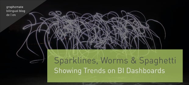
How to show trends – Sparklines, Worms and Spaghetti
I’ve been a big fan of sparklines for over 15 years now, so I thought it was high time I provided a more in-depth review of these “word graphics”.
The “invention” of sparklines is attributed …
read moreWe built a radar chart; but remain sceptical
At graphomate, we are known for graphomate suite and graphomate tiles – standard visualisation components that can be purchased and used “off-the-shelf”.
What is less well known is that we also put together custom visualisations …
read moreShow the Data. Tell the Story.: Comments & Annotations for BI Dashboards
Data visualisations form the core of a BI dashboard. They take the myriad buckets of corporate data and turn it into something bite-sized, informative, and aesthetically efficient. However, there has arisen, especially in recent years, …
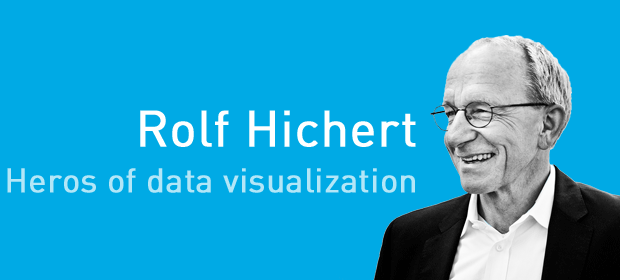
read moreMy heroes of dataviz (5/5): Rolf Hichert – the man of standards
Finally, to the only data visualisation hero I know: Rolf Hichert. Without him, graphomate would not exist.
The story is just too good to be true: In 2009, I was supposed to realise a stacked …
read moreOur summary of the DSAG Convention 2022, Leipzig, Germany
At long last, we were there! After a three-year hiatus, SAP users met for their annual congress over 11-13 October in the picturesque and historic city of Leipzig. It was fantastic to finally meet in-person, …
read moreWhy Faking It is Sometimes Harder Than Making It
One of the biggest challenges faced by BI visualisation SASS companies is having ‘good-looking data’ to demonstrate the powers and capabilities of a dashboard. This means that the charts and graphs generated by a demo …
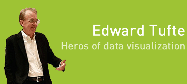
read moreMy heroes of dataviz (4/5): Edward Tufte – the information design Guru
Edward Tufte has been publishing about meaningful information design for almost 40 years. The New York Times even calls him the “Leonardo da Vinci of data”.
Edward Tufte – the informations design Guru
Yet Edward …
read moreComeback of the graphomate extensions for Microsoft 365
The day has finally arrived: Our graphomate charts and matrix are available for Microsoft 365. Rely on our dream team in Excel and PowerPoint to visualize your data and benefit from the functionalities of these …
read moreMy DataViz heroes (3/5): Willard C. Brinton – the unknown pioneer
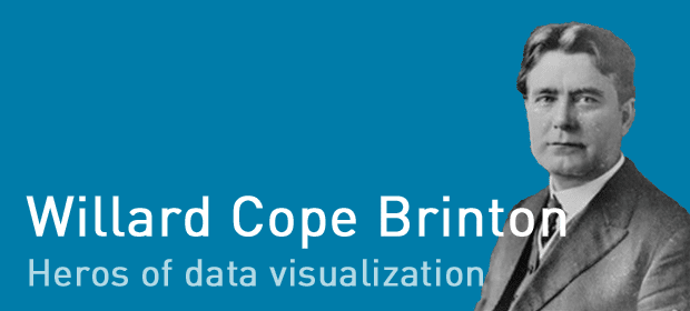
My first two data visualisation heroes – William Playfair and Florence Nightingale – were famous people. Today I would like to introduce a relatively unknown person: Willard Cope Brinton.
Willard Cope Brinton
Willard C. Brinton …
read more
