My heroes of dataviz (4/5): Edward Tufte – the information design Guru

Edward Tufte has been publishing about meaningful information design for almost 40 years. The New York Times even calls him the “Leonardo da Vinci of data”.
Yet Edward Tufte (ET), born in 1942, probably came to his vocation in a rather roundabout way. After graduating from Stanford with a degree in statistics and writing his doctoral thesis in political science at Yale, he was asked in 1975 – by then a professor at Princeton – to teach a statistics course for journalists.
He quickly realised that journalists do not only need statistical basics for good storytelling. The question of how information should be visualised so that readers understand and retain it quickly and correctly is at least as important, if not more so.
In the following years, together with John Tukey – another visualisation pioneer – he worked out a course whose material was to become the basis of his first book and classic of information design, “The Visual Display of Quantitative Information” from 1982.
However, the publication turned out to be difficult: no publisher could be found who met his demands on layout and production. So without further ado, he took out a – second – mortgage with an 18% (sic!) interest rate on his property and published the book himself. With success: his work became a timeless design classic and was reprinted two dozen times.

In the meantime, ET has published five books and offers visualisation workshops several times a year at which his books are handed out to the up to 300 participants.
What a nice business model …
At these events he avoids presentation software. Instead, selected visualisations from his books are viewed and discussed together. His credo: “PowerPoint is evil”.
Three principles from “The Visual Display of Quantitative Information” are particularly important for our graphomate developments:
Avoid Chart Junk – “Less deco, more info!”
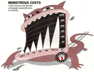
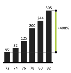
ET uses the term “chart junk” to refer to all visual elements that do not directly serve to depict information or support its interpretation. This includes decorative objects, 3D effects, bright colours, but also thick grid lines or hatching. Here is an impressive example of Chart Junk by Nigel Holmes from 1982 and our graphomate re-design:
Visualise correctly – “Tell the truth!”
The visual elements that depict data must be directly proportional to the numerical quantities to be displayed. In this context, ET also speaks of the “Lie Factor”. Manipulations such as truncated value axes must be avoided, as information cannot be interpreted correctly as a result. On the other hand, the situation is somewhat different for line charts: these certainly start at value axes ¹0, if e.g. the focus is on the change of the individual periods – as e.g. with sparklines, see below.
Here is a particularly striking example and our correct visualisation:
page 118, 2nd edition, 2001
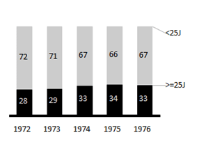
ET describes the original left chart as “the worst chart ever to find its way into print”. Probably not only because of the double cut value axis, which leads to a Lie Factor of ~25; the coloured 3D areas are also pure chart junk.
Maximise Data Density – “Above all else, always show the data!”
ET advocates a high information density when communicating facts.
“More information is better than less information.”
Source: Edward Tufte, The Visual Display of Quantitative Information,
page 166, 2nd edition, 2001
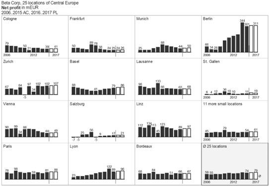
Our eye-brain system is able to absorb and process a very large amount of information in a short time. Large diagrams with few elements do not help in evaluating the information. Only a presentation of many data points and dimensions creates context and thus enables the recipient to understand facts correctly.
We are used to consuming our daily dose of information via highly condensed tables – football leagues, share prices and others. But the claim for a high visual information density – e.g. by means of small multiples as in the following illustration – requires the most persuasion in my experience.
ET is also considered the “inventor” of sparklines: simple, intense, word-sized charts. Sparklines are ideal for visualising trends (such as fluctuations in temperature or stock market prices) in a space-saving way. They are no taller than a printed line and can therefore be easily integrated into a table.
Here is an example of the development of exchange rates:
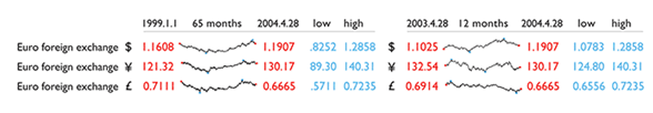
page 172, 2nd edition, 2001
However, this high information density comes at a price: Sparklines cannot all use the same scale as the small multiples shown above. They are therefore NOT comparable with each other, but can only be read horizontally.
We have integrated the idea of sparklines into our graphomate matrix. With a few clicks you can display a trend over time in a column. We have gone one step further and implemented sparkbars in addition to sparklines. Sparkbars scale identically across the rows and can therefore be compared with each other.
Here is an example of our graphomate matrix in Excel/MS365:
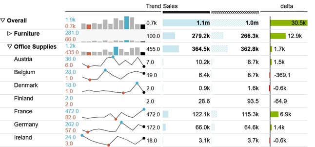
While sparkbars are used on the 1st hierarchy level of the product group, sparklines are used to visualize trends in the individual countries. The last value is formatted in black, maximum and minimum are displayed in blue and red for easier classification.
Best of all, you can use the sparklines and sparkbars not only in MS365 but also in SAP Analytics Cloud, Power BI and Tableau. They work identically everywhere.
Back to Edward Tufte. Currently, ET is more of an artist. His own 100,000 sq. ft. sculpture garden in Connecticut is quite impressive:

Stay tuned
Lars
PS: I just found out that Mr Tufte has a second forename: it’s Rolf – Edward Rolf Tufte … really!

This file is licenced under the Creative Commons-Licence.