graphomate
bubbles
Meaningful portfolio analyses
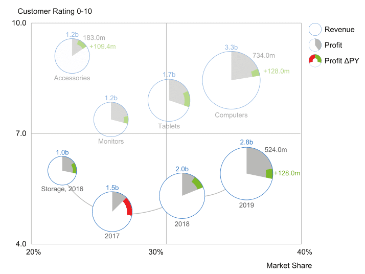
In contrast to other graphomate extensions, our graphomate bubbles offer two value axes. This allows different representations such as bubble charts, scatterplots or multidimensional portfolio analyses. In accordance with individual requirements, the large range of settings realizes the representation of different pie charts.
The goal of the visualization is to get a quick and easy overview of distributions and relationships among data points. Patterns and outliers can be recognized quickly for better interpretation and decision-making. For example, deviations from a previous year’s value can be plotted on the arc.
Our graphomate charts for Microsoft Power BI are available exclusively at Microsoft AppSource:
Advantages of the graphomate bubbles at a glance
- mapping of portfolio analyses according to the scheme of the BCG matrix
- Small multiples display (top n + rest, display according to space availability)
- connection of bubbles to represent developments over time
- application of conditional formatting
- support of different zoom modes for increased readability
The graphomate bubbles are available for
Versatile visualization with graphomate bubbles
The high information density results from the mapping of up to five key figures. Our bubbles are positioned in the Cartesian coordinate system. Size and origin of the reference system can be defined by the user. The same applies to the division of the grid lines or further helper lines such as arbitrary functions.
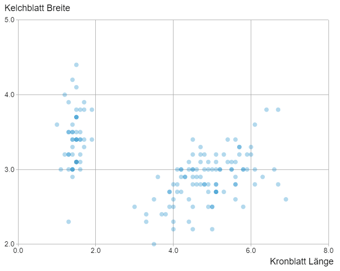
When mapping two (dependent) characteristics, we speak of a scatterplot. Here the two depicted dimensions correlate with on another. With the introduction of a third characteristic a pie chart is created. The use of circular arcs increases the information density further.
Portfolio analysis (BCG matrix)
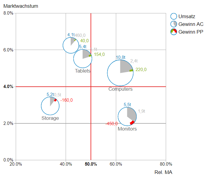
Portfolio diagrams are very well suited for the visualization of positioning strategies. They show volumes and developments in a field of tension between market shares and growth potentials. Usually, the relative competitive strength is plotted to the right and growth or market attractiveness is plotted upwards.
On the left side you can see a so-called BCG matrix which was invented by the Boston Consulting Group to help corporations analyse their business units and make better strategic decisions.
Visual tuning through functionalities
For further customization of the chart, functionalities such as conditional formatting, smart number formatting and labeling are available. The graphomate bubbles can display lines for median, average and trend values to enable the viewer to make a quick statistical classification. In addition, target zones can be defined to highlight the desired data. Furthermore, conditional formatting can be achieved within a few klicks.
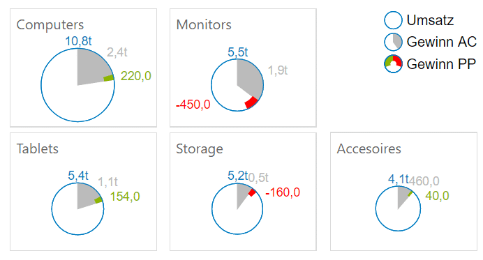
Since there is a strong need for business users to see data represented in rankings, our developers invented a further mode for the graphomate bubbles which we call Small multiples mode. As the figure on the right side shows, it depicts the bubbles without a coordinate system but sorts the data according to their size and sums up the rest.
Conclusion: The graphomate bubbles are perfectly suited for the representation of portfolios. They offer numerous options for extensive analyses with the help of circular charts.

