graphomate
charts
Meaningful diagrams
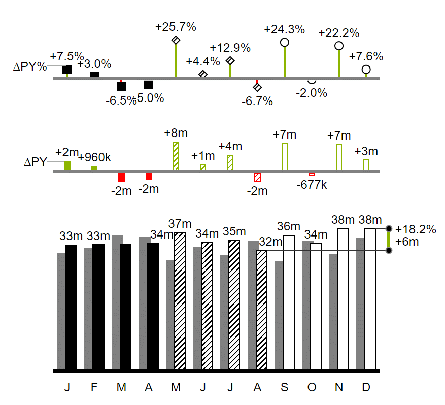
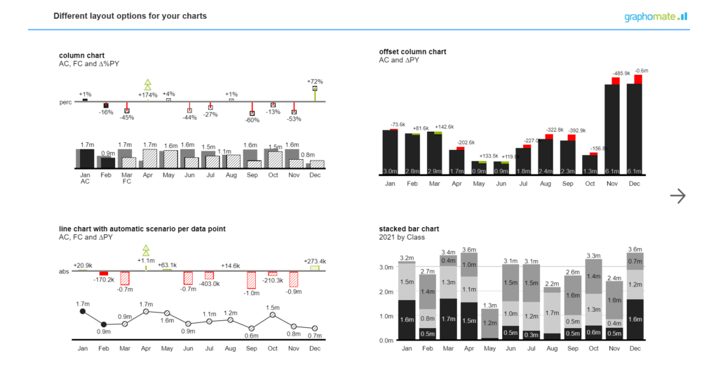
The graphomate charts, graphomate´s first product, remain our top seller. Through constant evolution and optimization we are able to offer our customers the most sophisticated chart component on the market. Based on six chart types you can easily implement the recommendations of the International Business Communication Standards (IBCS). At the same time graphomate charts can be customized to fit your needs.
In addition to bar and column charts, you can use needle and stacked bar charts, but also waterfall charts – for example for P&L or contribution margin calculations – to realise a standardized notation.
Our graphomate charts for Microsoft Power BI are available exclusively at Microsoft AppSource:
The advantages of graphomate charts at a glance
These possibilities are particularly noteworthy
- integration of deviations directly into the diagrams
- individual scenarios for each datapoint
- identical scaling of multiple charts within one dashboard
Furthermore, outlier logic, data-driven reference lines and the layering of diagrams can be implemented with just a few clicks.
Live Report
Try graphomate charts directly in the live report. For example, by clicking on an element of a graphomate chart you can set a filter state on the whole report. The visuals adapt according to the selection.
graphomate charts are available for:
graphomate charts offer around 200 settings
To enable you to adjust your charts according to your needs we provide around 200 different settings in a new user interface which is identical in all supported BI tools. Thus, our graphomate charts are more of a comprehensive IBCS application than a mere visualization extension. Plus: The graphomate charts are IBCS-certified.
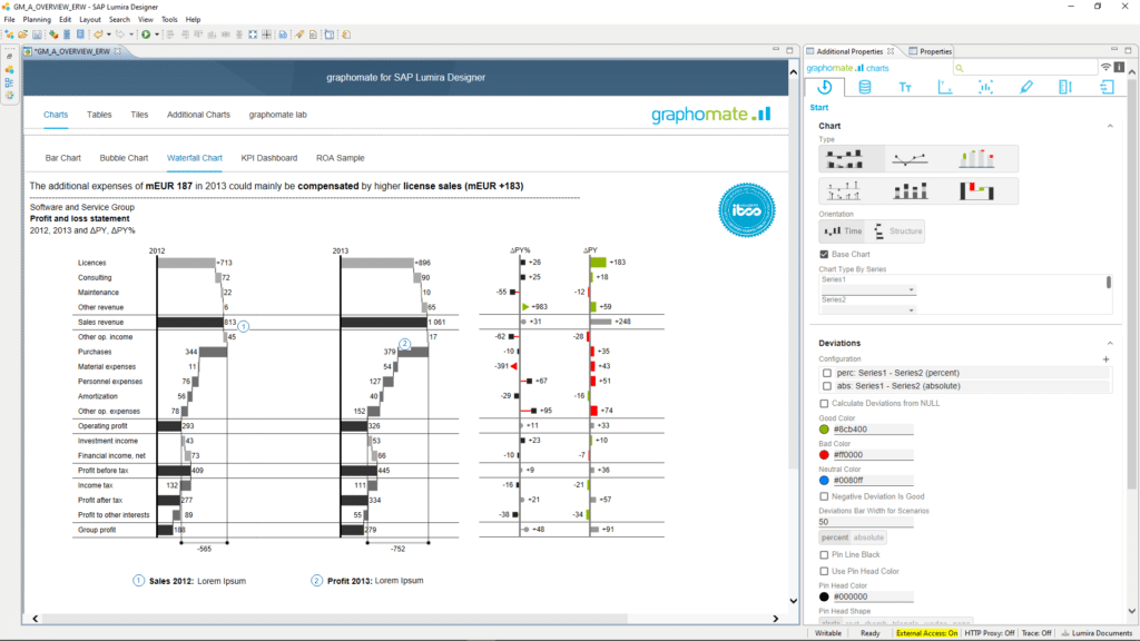
In 2010 we released our first version of graphomate charts for Xcelsius. Since then, more than 150 companies have started using our charts. After focusing on SAP Lumira and its predecessor Design Studio, it is now available for a wide range of business analytics products:
- Microsoft Power BI and Microsoft 365 (Excel & PowerPoint)
- Tableau
- SAP Analytics Cloud (SAC), SAP Lumira Designer, Web Intelligence
Additionally, we offer a separate library for SAP UI5 in order to use IBCS-compatible visualizations in SAP Fiori applications.
Regardless of the front end, our graphomate charts support interactions between elements of visualization for the implementation of dynamic dashboards.
Say goodbye to constant retraining
Our code base as well as our user interface are identical for all the above-mentioned business analytics products. This means that your report developers do not have to familiarize themselves with each tool from scratch – what a relief. This also allows the exchange of graphomate charts templates between different business analytics products. Thus, you can import a graphomate chart created in SAP Lumira Designer into Microsoft Power BI or integrate it into SAP Fiori – without having to reset the parameters..
The key features of graphomate charts at a glance
- six chart types that can be aligned horizontally or vertically
- different chart types in one chart (“combination charts“)
- easy integration of absolute and percentage deviation diagrams
- Comparison Group for uniform scaling of charts within a reporting application
- freely definable scenarios – color, fill pattern, shape – per data series or data point
- highlighting of differences between data points via single and multi highlighting
- display of additional data-driven reference lines
- automatic avoidance of label collisions
- template management via the graphomate server
- definition of outliers
- export to graphomate charts for Excel or as .png element
- comprehensive formatting options for category, data series and data labels
- hierarchical representations of category labels
- tooltips
- display of a value axis
- title field, scaling helper and separator frames.
In addition, SAP Lumira Designer and the SAC Application Designer provide a powerful scripting language that allows for very precise interactions within a dashboard. We support this scripting language comprehensively: All parameters of the graphomate charts can be accessed via the scripting language.

