My heroes of dataviz (5/5): Rolf Hichert – the man of standards

Finally, to the only data visualisation hero I know: Rolf Hichert. Without him, graphomate would not exist.
The story is just too good to be true: In 2009, I was supposed to realise a stacked column chart in Excel and it didn’t work out at all. My boss at the time finally implemented the chart with coloured Excel cells of different heights … really! 🙂
This was not acceptable for me: I had already intensively dealt with the topic “visualisation of information” and I was ambitious to find a better way to build this chart type.
So I started looking for solutions and after some research I found Rolf’s course “Designing business charts with Excel according to the SUCCESS rules”.
My participation in this course should change my life completely …
But first: Who is Rolf Hichert?

How could it be otherwise: again an engineer, not a businessman.
After his mechanical engineering studies, Rolf worked for the Fraunhofer-Gesellschaft and McKinsey.
However, he decided against a “corporate career” and worked as a professor at the Universities of Applied Sciences in Konstanz and Eberswalde. In 1986 he was co-founder and managing director of MIK AG – an early provider of reporting solutions.
From 2004, he began to work more intensively on the topic of business communication and embarked on a mission: business reports should be able to be understood like musical scores or circuit diagrams without a legend. The mission was to convince financial analysts worldwide of the advantages of standardised reports and dashboards – against the eye-candy, colourful, blinky blinky stuff we usually saw these times.
After years of work, Rolf published the first SUCCESS poster in 2008 in the tradition of Playfair, Brinton and Tufte with 98 rules divided into 7 sub-areas:
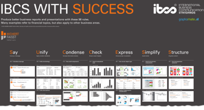
Thousands of these posters hang in offices worldwide today.
In 2013, the SUCCESS Rules became the International Business Communication Standards and with a view to his well-deserved retirement, Rolf transferred all his intellectual property to the IBCS Association. The association now takes care of the further development and propagation of the standards.
Back to my 2009 course. How can a two-day course question everything?
Well, I felt like I had been brainwashed. On the one hand, as a dashboard designer, I made pretty much all the mistakes that SUCCESS said I should avoid. Furthermore, it seemed almost impossible to implement only a fraction of the SUCCESS rules with any BI tools.
The idea was born: I will develop a visualisation software that implements SUCCESS out-of-the-box. I quit my job, looked for partners and the result is graphomate. 🙂
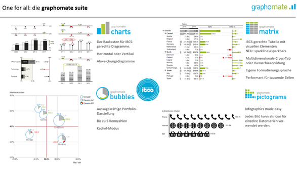
This made us the first software certified according to the IBCS. And since our founding in 2010, we have continued to develop: by now, our visualization add-ins are available for SAP Analytics Cloud (SAC), Power BI, Tableau and MS365.
The UNIFY rules in particular have become something like the brand essence of the IBCS – it’s all about standardisation. The basic idea is actually unspectacular: similar to how music sheets can be read by musicians worldwide, the goal of the IBCS is to standardise reports and report objects.
A first approach is to map scenarios such as actual, planned and other values uniformly throughout the company:
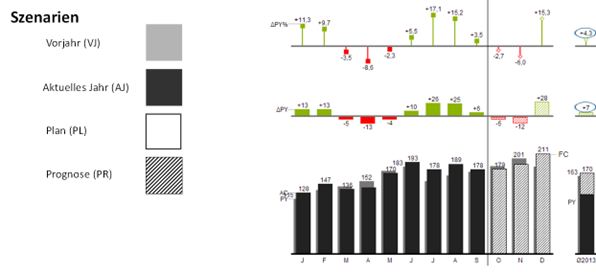
After a certain period of familiarisation, charts no longer need a legend and are understood by all recipients. This approach has caught on. Also thanks to the really recommendable book by Rolf Hichert and Jürgen Faißt: “Filled, Framed, Hatched – How Visual Uniformity Improves Communication with Reports, Presentations and Dashboards”
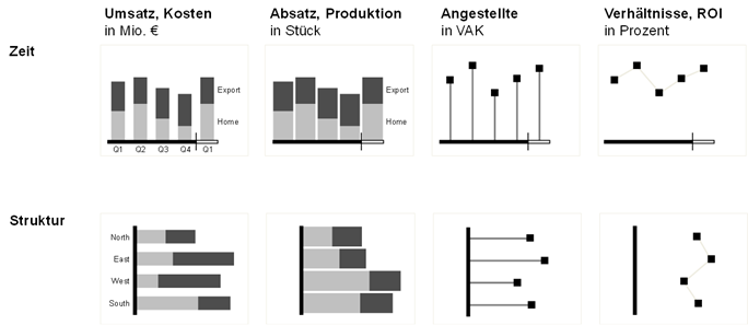
However, some companies go further and link key figures with different chart types.
Why not always use a needle diagram to visualise “head counts”? This becomes visually clear immediately:
In any case, we can meet all these requirements with our graphomate suite – regardless of the BI tool: our charts, matrix, bubbles and pictograms work the same in SAP Analytics Cloud, in Power BI and in Tableau as well as in MS365.
This post concludes my five-part series on my data visualisation heroes. I confess that not all of my “heroic deeds” were present to me at the beginning of my involvement with the topic of visualisation in 2008.
Some I only got to know in the last 10 years – lifelong learning after all … 😉
But it remains an exciting topic!
May good visuals be with you
Lars

This file is licenced under the Creative Commons-Licence.