My DataViz heroes (3/5): Willard C. Brinton – the unknown pioneer

My first two data visualisation heroes – William Playfair and Florence Nightingale – were famous people. Today I would like to introduce a relatively unknown person: Willard Cope Brinton.
Willard C. Brinton was born in Pennsylvania in 1880 and graduated from Harvard in 1907 with a degree in mechanical engineering(!). After graduating, he travelled the world and – back in New York – set up his own business as a consulting engineer.
In 1914, at the age of 34, he finished his book “Graphic Methods for Presenting Facts”, which, however, was not to be published until 1917.
For me, it is a milestone in the literature on the subject of “data visualisation”. A work that has lost none of its topicality even over 100 years later: a timeless textbook that is still really good to read today. I even got myself an original edition – – don’t ask at what price 😊
Brinton’s book contains many diagrams and describes graphic techniques as they were used at the time of the book’s publication. He structures and comments on these third party visualisations and in this way helps readers to have a lasting learning experience. An approach that can be found again 70 years later in the works of Edward Tufte.
Brinton was quite sure of his pioneering work. As the introduction to his book states, “As far as the author is aware, there is no book published in any language covering the field which it has been attempted to cover here.” He sums up the advantages of a visual representation of data beautifully:
“If the facts were put in graphic form, not only would there be a great saving in the time of the readers but there would be infinite gain to society, because more facts could be absorbed and with less danger of misinterpretation.” Brinton, p.2
And what type of diagram does he discuss right in the first few pages? Of course: the pie chart! Loved by managers, scorned by information designers.
“There is no data that can be displayed in a pie chart that cannot be displayed better in some other type of chart.”
John W. Tukey, quoted after Edward Tufte
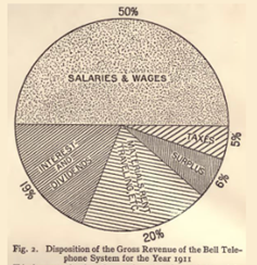
I find it remarkable that he uses an example from the 1911 annual report of the American Telephone and Telegraph Company. A business chart showing gross revenue by type of cost.
However, the term “pie chart” did not seem to be in widespread use yet, although even then it was the most commonly used type of chart for showing proportions.
Brinton writes of “circle with sectors” and:
“The circle with sectors is not as desirable an arrangement as the horizontal bar … “. Brinton, p.5
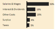
The first figure in Brinton’s book shows a horizontally stacked bar chart, which in his view should be better used to visualise shares. I can fully agree with this:
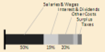
The bar elements can be compared much more easily – length instead of angle – and the labels are all horizontally aligned.
This also makes it easy to evaluate the proportions of the total.
Alternatively, instead of a pie chart, you could also use a simple bar chart for visualisation if the focus is on a simple comparison of the individual bar elements with each other.
Also donuts with many sectors are not easy to understand. Here for example at a large chemical company:
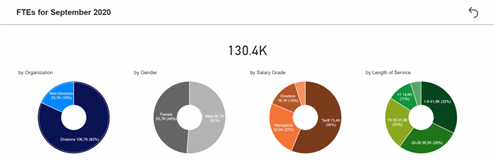
It is astonishing that this collection of donut charts has found its way into the report portfolio, the other pages of the Power BI App are really well implemented according to the rules of good information design even according to the IBCS.
But pies are just so nice and round and look good – the interactive effects when clicking on a donut piece are of course also very impressive, but in my opinion do not really help to understand the data better.
One more thing … from the presentation master himself: Steve Jobs.
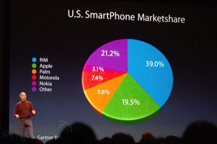
Steve used this pie chart at MacWorld 2008 to visualise Apple’s market share. Clever how Apple’s 19.5% share appears visually larger than the 21.2% pie slice. 3D effects make it possible … pure chart junk. More on this in the next blog about Edward Tufte!
Nevertheless, I would like to contribute something to the honour of the pie chart. In my opinion, they make perfect sense with a few – up to three – sectors. In these cases, the share of the total can be easily estimated. Our graphomate bubbles use these “simplified” pie charts – even very extensively:
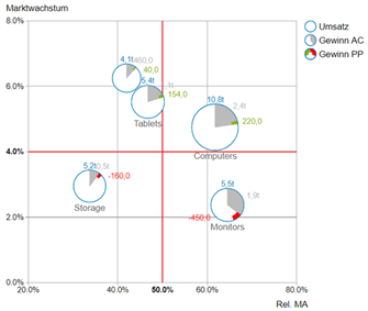
The rule: “What’s worse than a pie? Many pies!” does not apply here either. 😊
The grey sector, which visualises the profit, can quickly be set in relation to the turnover and even a comparison across the product groups is still easily possible – even if not exact.
But that is not the goal either… Detailed data is available by clicking on a pie element.
Back to Willard Brinton: He does not explicitly comment on Polar Area Charts like Florence Nightingale’s Rose Chart – he mainly uses American sources – but he has a very clear opinion on circular charts, as he states with this Radar Chart – still a very popular chart type these days:
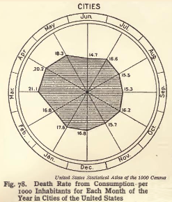
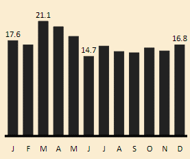
“It is difficult to see how such an unsatisfactory type of chart ever came into general use, unless it was because there are twelve months in a year and twelve hours on the face of a clock.This type of chart should be banished to the scrap heap. Charts on rectangular ruling are easier to draw and easier to understand.”
Source, Willard C. Brinton, p. 80
He is right, a simple bar chart does the job much better.
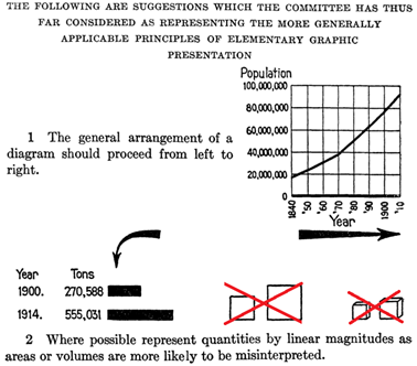
Brinton became a full member of the American Society of Mechanical Engineers (ASME) in 1914, and in the same year also chaired a new committee to develop standards for graphic representation. Yes, you read that right: Standards for Graphic Representations. In a first article of this committee, proposals for the standardisation of line diagrams are developed:
It seems, there were actually approaches to standardising the presentation of information even before the International Business Communication Standards (IBCS) More on this, in my article on Rolf Hichert – the one after the next – but first on Edward R. Tufte …
Stay tuned
Lars

This file is licenced under the Creative Commons-Licence.