How to show trends – Sparklines, Worms and Spaghetti

I’ve been a big fan of sparklines for over 15 years now, so I thought it was high time I provided a more in-depth review of these “word graphics”.
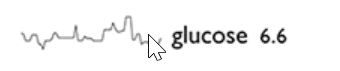
The “invention” of sparklines is attributed to Edward Tufte, as briefly mentioned in a previous post of mine. In his 2006 book Beautiful Evidence, he describes sparklines as “intense, simple, word-sized graphics that depict trends in a meaningful and information-dense way.” Here is an example of such a sparkline:
How are sparklines used on dashboards?
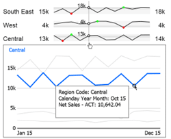
Back in 2008, I built a dynamic dashboard [sic.😉] in Excel that made extensive use of sparklines. Here is a section from that dashboard:
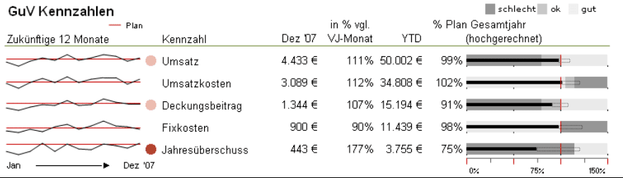
On the far left, the changes in five key figures over 12 months are shown with planned values in red.
The target achievement for the entire year is shown with bullet graphs, a visualisation alternative to Stephen Few’s speedometers.
In finance and controlling, this combination of trend display and the display of the degree of plan fulfilment for the year to date is common convention.
But are sparklines easy to interpret?
Sparklines show the trends of several time series in a very small space in accordance with the spirit of Tufte: “Above all else, always show the data.” We can, at a glance, see patterns and outliers in the lines without delving into too much of the detail.
This is also in the spirit of IBCS (International Business Communication Standards) with its demand for high information density in the visualisation of information: Condense.
But for Rolf Hichert – the founding father of IBCS – sparklines are a no-go: “I am very sceptical about the use of sparklines in dashboards”. We’ve even had our fair share of professional disagreements about the pros and cons of these trend displays since he and I first met in 2009.
But why exactly does Hichert never tire of dismissing sparklines somewhat disrespectfully as “worms” in his presentations? The reason is because they are not uniformly scaled and thus not visually comparable to each other.
Here is an example from Hichert’s presentation Small is Important, But Not Always Right to illustrate his repugnance towards sparklines. 240 values of a table are first visualised as individually scaled sparklines and for comparison by means of a uniformly scaled line chart.
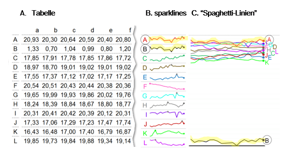
Let us look at the first two sparklines A + B highlighted in yellow, whose course is identical. In the “spaghetti lines” to the right of them, it becomes clear that data series B is to be evaluated quite differently from series A. The data points are smaller by a factor of about 30.
From the above, it follows that the dips in the middle segment of sparklines A + B are also to be evaluated very differently i.e., B is probably negligible. Nevertheless, a pattern is clearly recognisable which is almost completely impossible with the spaghetti lines! To analyse the trends in more detail, users can be given the possibility to use further tools such as filters, jumps, tool tips etc.
Building sparklines with better UX and interpretability
During the development of our graphomate sparklines for SAP Lumira Designer we came up with some ideas to support users in their correct interpretation as illustrated in this two graphics.
In particular, we decided to harness the interactive capabilities of dashboards, which gave us these functionalities:
- The data values appear on a vertical line when hovering over the sparklines.
- Clicking on a sparkline opens a pop-up window that shows all sparklines scaled comparably as line charts. The selected sparkline is highlighted.
- We show the range of the underlying data values of a sparkline with a grey area in the cell. This area is aligned with the other sparklines, so that it is immediately recognisable as to which sparkline represents large and which small values.
- Single values can be analysed with a tooltip and a jump can be realised with these values as a filter – even in the “spaghetti diagram” of line charts.
We have taken a different, albeit simpler approach to sparklines in our new graphomate matrix. Users can choose between sparklines and sparkbars. The latter scale uniformly, and the min/max and the last value are highlighted as seen in this table:
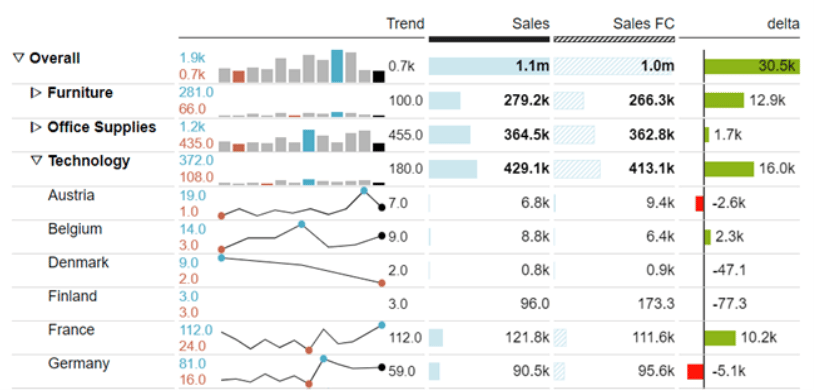
A unique feature is that sparklines and sparkbars can also be used simultaneously on these tables. Like this, sparklines can be used to show trends at the lowest hierarchical level of a large table, since the large number of values makes comparison quite difficult anyway.
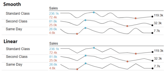
And yes, thanks to popular demand, users can also choose between sparklines to be drawn either “smooth” or “straight”. 😀
Does this end the debate about sparklines?
Most probably not. As is so often with visualisation topics: there is no 100%-correct rule. As always, the perfect solution will depend on the individual requirements.
Over to you now. What’s your view on sparklines? Do you believe they are mere squiggly distractions that have no place on a dashboard?
Or do you, like Bissantz, whose office dog wrote a Sparkline-Duden and Edward Tufte who just tweeted about the “Sparklines Festival”, think they can be helpful visualisations when built correctly?
Let us know what you think!
May good visuals be with you
Lars

This file is licenced under the Creative Commons-Licence.