We built a radar chart; but remain sceptical

At graphomate, we are known for graphomate suite and graphomate tiles – standard visualisation components that can be purchased and used “off-the-shelf”.
What is less well known is that we also put together custom visualisations to meet the more exacting requirements of some of our clients. To top it all – based on our architecture – these components work straight out-of-the-box on every BI platform we currently support – Power BI, SAC, Tableau and MS365.
Some time ago, we received a request from a consulting partner to develop a customised radar chart (also known as a web chart, spider chart or network diagram) that produced identical results on all BI platforms. For the sake of academic rigour, in this article we shall analyse the radar chart in a bit more detail and see where some of its drawbacks and disadvantages lie, but also where it can be genuinely useful as a visualisation tool.
Why radar charts?
Consultants and academics tend to like presenting their results with radar charts due to their being “nice and round” and “eye-catchy” as depicted in these illustrations:
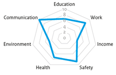
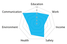
Generally speaking, radar charts have a place low down on our list of good visualisations. The employees of a Dutch environmental agency, whose examples I use below, agree. Source: Visualising knowledge | PBL Planbureau voor de Leefomgeving
Some examples of why we view radar charts critically
The basic problem is that even though the lines and areas catch the viewer’s eye, the information shown lies in the intersections of the axes. This leads to some drawbacks:
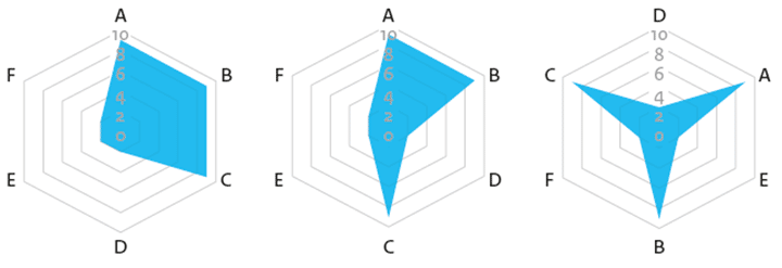
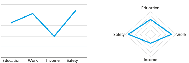
1. The shape of the connected data points is completely arbitrary
If you change the order of the axes, you get completely different areas with the same data.
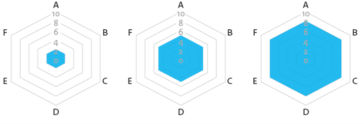
2. High values are displayed too large
The area that results from large values is misleading due to the larger distance between the axes at the outer edge of the diagram.
3. Linkages between categories are misleading
As with line charts, the radar chart appears to show a relationship between categories when it connects the data points even when no such relationships actually exist.
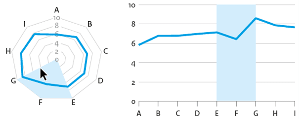
4. Lines cannot be interpreted because of the radial arrangement
An increasing trend cannot be discerned in this radar chart, but it can be clearly seen in the line chart.
As always, the devil is in the detail!
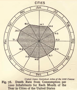
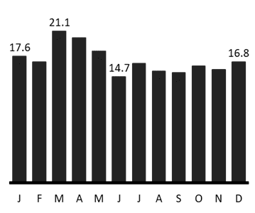
By the way, the points of criticism above are also valid for all kinds of polar diagrams – e.g., Florence Nightingale’s Rose-Chart: My DataViz-hero (2/5): Florence Nightingale – The Lady with the lamp.
What do the experts say about radar charts?
Willard C. Brinton, one of my heroes of data visualisation, opined in 1914 that radar charts belong on “…the scrap heap.” and that bar charts are always preferable to them.
“This type of chart should be banished to the scrap heap.
Charts on rectangular ruling are easier to draw and easier to understand.”
Criticised for a hundred years, radar charts have nevertheless evolved into an indispensable part of any consultant’s presentation. Bar charts are simply too boring, and nice round charts will at least have the ability to hold the viewer’s attention – or so the current thinking goes.
Does the radar chart have any redeeming values?
A useful application of radar charts can be an analysis of outliers or in the form of small multiples. Additionally, if cyclic and non-linear data are visualised, e.g., wind strengths by wind direction, radar charts can provide a powerful and meaningful visualisation.
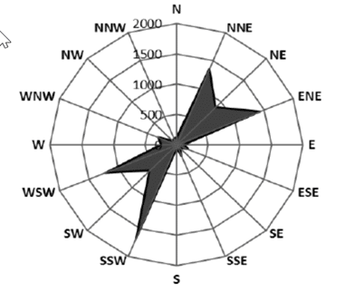
(Source: Wind Power Potential in Turkey)
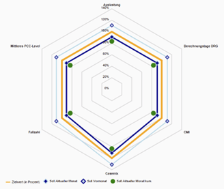
Finally, the radar chart that we developed on behalf of our client which meets their requirements quite well and works without any problems on all major BI platforms:
Feel free to contact us if there are visualisation requirements that cannot be implemented with standard tools. We at graphomate will do our very best to build it, regardless of your requirements!
May good dataviz be with you
Lars

This file is licenced under the Creative Commons-Licence.