Show the Data. Tell the Story.: Comments & Annotations for BI Dashboards

Data visualisations form the core of a BI dashboard. They take the myriad buckets of corporate data and turn it into something bite-sized, informative, and aesthetically efficient. However, there has arisen, especially in recent years, a need to be able to add expert analyses to provide more meaning to the graphics. Data is based on cold and calculated figures that often hide real-life factors that cannot be adequately quantified, but nonetheless are crucially important considerations for businesses.
For this article, we spoke to Daniel Molkentin, software engineer and visualisations expert at graphomate, about how dashboard builders and users can annotate their graphics with expert notes and analyses.
Daniel, tell us about the demand for a dashboard annotation functionality..
DM: A lot of our customers who have been using the graphomate extensions to develop dashboards have been asking for a comment writing functionality. They cite cases where they need to add expert notes and to highlight the so called ‘story’ behind the data. Take for instance the recent corona pandemic and the way it affected the business world. Or socio-economic upheavals that have affected consumer behaviour. Even seemingly minor political changes like a mini budget from a replacement Prime Minister can have profound impacts on the behaviour of businesses on a regional basis. Such information on a dashboard can help explain the behaviour of data better than with only the graphics.
That sounds reasonable. Are there any existing methods for adding comments on dashboards?
DM: Yes, there are, but they are quite limited in their capabilities. SAC for instance has a method for adding comments, but they do not allow a lot of granularity e.g., down to individual datapoints. Additionally, comments inputted at various levels of data cannot be viewed in a hierarchical form making it difficult to have an overview of all comments for that visualisation. Another issue is the fact that these comments are hosted directly by SAC and not on-premises. This can be a security concern for sensitive analyses.
You and the graphomate team have also developed a commenting widget. How does it work?
DM: This picture shows an example visualisation with comments tabulated next to it.
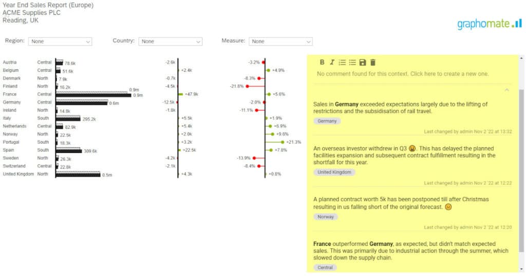
As you can see, we have comments for the various countries and regions. You can drill down to various levels of the data hierarchy and the corresponding comments box will automatically update to show the user what comments are relevant for that particular visualisation.
In addition, each comment has a tag attached to it – for example, the country name – which is the level where the comment was inserted. These tags can be used as filter links in case you wanted to see all the comments for a particular country, for instance.
That sounds like quite a clever system. But can I use it on other platforms?
DM: The widget currently only works on SAC, but it will eventually be available on every platform for which we have developed graphomate extensions – i.e., MS 365, Power BI, Tableau etc. What is more, it will work even if you access your data from another platform. This means that if you develop a dashboard on SAC and pull up that data on Excel, all comments can be called up and displayed on the new platform without any loss of information.
What about the security of these comments?
DM: The information on graphomate comments is hosted locally as opposed to by the platform you use. This allows far more security and privacy than is otherwise possible.
When can we expect to be able to use graphomate comments?
DM: We are currently looking at Q1 2023 as when it will be feature ready with releases being made available soon after.
Many thanks. We look forward to seeing how things develop with this new widget!

This file is licenced under the Creative Commons-Licence.