Why Faking It is Sometimes Harder Than Making It

One of the biggest challenges faced by BI visualisation SASS companies is having ‘good-looking data’ to demonstrate the powers and capabilities of a dashboard. This means that the charts and graphs generated by a demo dashboard should not look repetitive or overtly random but have subtle nuances, variations and justifiable patterns that simulate real-life corporate data more closely.
Sounds like a simple idea, you say. Well, product developers have struggled with this for a very long time and, surprisingly, there is no text-book solution yet. Here we have a chat with Jan Häbry of graphomate about his solution.
So, Jan, tell us about the platform on which you are working.
JH: Sure. I am currently working with building extensions for SAP’s UI5 package. Like a lot of dashboarding software, UI5 has huge capabilities that are often overlooked. We therefore would like to showcase some example dashboards to help generate interest in UI5 and graphomate’s extensions. For that, we need demo data.
What’s wrong with using real-life data?
JH: Generally speaking, we could anonymise real-life corporate data e.g., the sales figures for the product range of a large automobile manufacturer, but they would never be truly anonymised as the unique patterns in the data can give away the client’s identity.
That makes sense. Talk us through the demo dashboard you have.
JH: This is an example dashboard we have built and can be read hierarchically from top to bottom and from left to right.
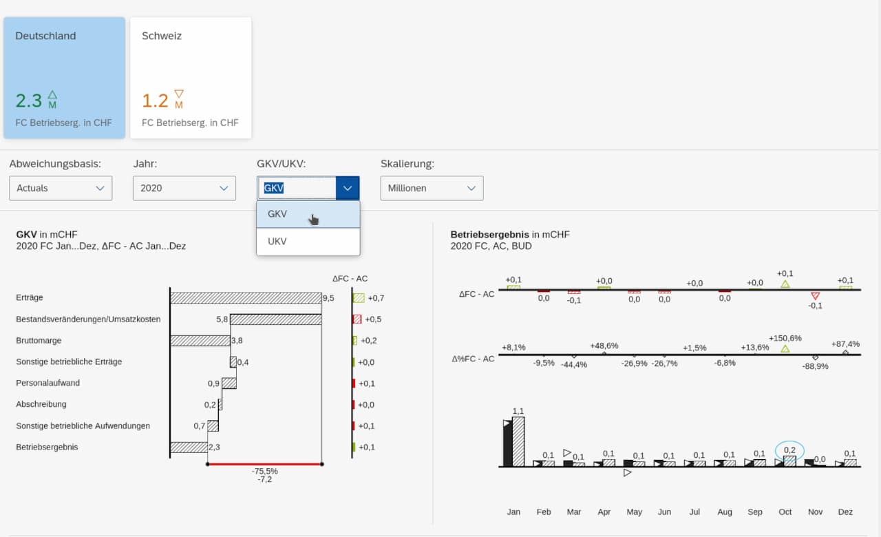
By clicking on the data points of the individual visualizations, you can filter out the data for all the other visualisations. In this way, the report can be navigated logically from the overview level to a level of more detail. This is best demonstrated in the matrix visualisation below the main dashboard.
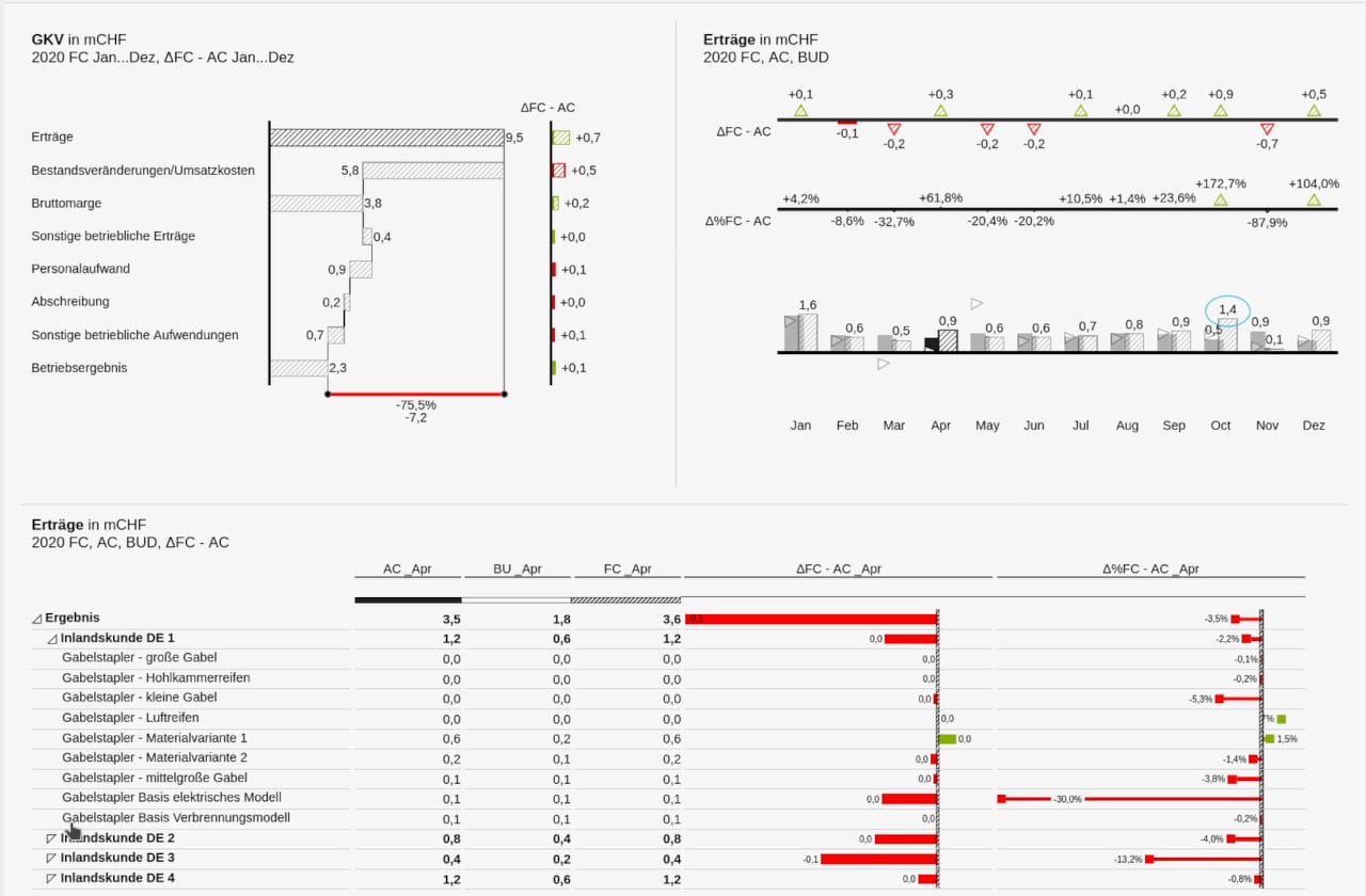
Here you can see that by clicking on ‘Erträge’ and then the month of April, I have all the details for that period displayed in my matrix..
That looks pretty nifty. Talk us though the data generation process behind this demo dashboard.
JH: Well, first of all, there is the issue of the sheer mass of data needed for this dashboard design. There are eight different dimensions with up to twelve characteristics in each dimension. If we wanted to create a data set that had a well-formed visualisation in all possible filter states, we would need almost 400,000 data points in our case. Of course, creating these by hand is not practical.
We looked at two possible solutions.
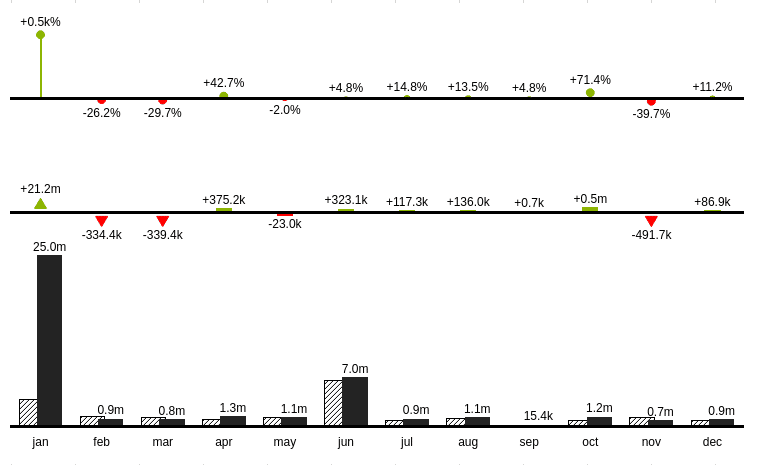
Solution 1: Generate the data randomly. A problem with randomly generated data is that when aggregated to higher levels, they may no longer have a uniform range of values. This can create very unsightly charts and distract the viewer from the actual topic. This visualisation, for example, shows a large outlier that would not normally happen in real-life.
Solution 2: Since this is only a demo dashboard, the available paths and functioning have been artificially restricted, e.g., only the months of January and July provide meaningful values in this particular visualisation. In this way, a consistent story can still be told in a presentation without the amount of data in the background being out of control.
For this solution we used a sample of real-life data from previous years to feed into a model that replicated the variations and patterns in that data into later years. Mathematical formulae such as ‘allocation’ and ‘planning’ functions were used to mimic the real-world data. The end result is a much more aesthetically pleasing and realistic looking data set
That’s great work. Now that you have a working demo, tell us why you put in so much attention to detail when showcasing a product.
JH: It’s simple really. By demonstrating how a dashboard can be generated to deliver meaningful visualisations that are custom made for specific businesses, we are helping potential clients see the power of these platforms and extensions. Businesses are extremely complex and varied in the type of data they generate for their BI analytics platforms. By creating something that closely resembles this real-life data, we can hopefully build trust and confidence in the abilities of the services we provide.
Many thanks. We look forward to seeing how data simulation develops at graphomate.

This file is licenced under the Creative Commons-Licence.