Visualization: Efficient Dashboard Design (1/2)
Donald MacCormick – long-time -Xcelsius aficionado at Business Objects and now Chief Product and Marketing Officer at antivia – has recently published an article about „Effective Visual Design” and its meaning for Dashboards. According to his opinion, there is something more important than that!
I have a slightly different opinion …
I have met Donald MacCormick last year and had the pleasure to experience on of his presentations – simply brilliant! I assume that we have, in principal, similar views concerning Dashboard Design. However, for me “Visual Design” has a higher significance.
Donald concludes his remarks with this sentence:
„I would argue that understanding the business context of a dashboard and how it will be used is many, many times more important … than any visual design.”
I agree unreservedly with the fact that customer-requirements for a Dashboard are decisive for a successful implementation. But for me the visual design of a dashboard is an inseparable part in the process of requirement elicitation. Therefore visual design is not more important or less significant but an equally important integral part for the successful implementation of Dashboards.
Donald quotes Andreas Bitterer, analyst at Gartner, saying that
“BI is not there to let you know, it is there to let you act”.
Hold on, how can I act in a targeted way if I do not know what is going on? Until now my simple BI-triad was: Data → Information → Knowledge. BI „converts“ Data to information thus generating knowledge. This knowledge is the basis for decisions.
Therefore BI has the goal to support decisions („to let you act”), which is not possible without the receiver-appropriate processing of information as the basis for the deduction of knowledge („to let you know”). For that reason visual design of dashboards is so important for me.
Efficient dashboard design on the basis of graphical visualizations helps the eye-brain vision system with the generating of knowledge.
A simple example of how efficient information presentation supports our cognition of knowledge. Look at the following block of numbers as a visualization of information. How often can you find the digit “3” in the following block of numbers?
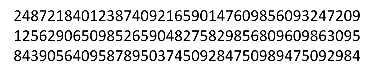
It takes some time until we have the answer. And it is not proven if we really have found all of the digit “3” . So we are checking again and that takes some time …
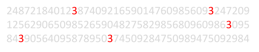
On the other hand, see how different it is if we just make a slight change to the layout of the block of numbers and highlight the important information – in this case the digit 3.
 Source: http://www.slideshare.net/janwillemtulp/data-visualization-5724069
Within seconds – if at all – we recognize the right answer: the block contains the digit 3 five times. Both layouts enable us to answer the proposed question. Therefore both are effective. The gray and red formatting, however, is much more efficient because the results are faster to recognize! Therefore I rather prefer to talk about efficient visual Design.
I am not concerned about the rate of information processing as a value per se but about the possibility to process more information simultaneously at a glance with an intelligent Dashboard-Design. This is the only way to recognize patterns, trends, structure breaks or outliers more easily. At this point visual design on the basis of charts comes into play.
Let us take a look at the following table:

Here we can see 88 informations about sales and marketing costs by region about a period of time. Such or similar tables can be found in countless reports. But is it possible to derive trends and patterns easily using this table? More likely no. Similar to the search of the digit 3 we gaze at the table and have to compile the correlation behind the data with great effort.
Let us now take a look at the visualization of this data basis as simple line charts:
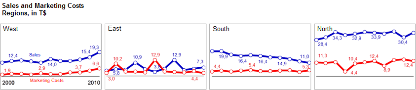
Within seconds, we are able to recognize how each region has developed, if there is a connection between turn over and marketing costs and which sales manager will get a call! The line charts provide for an efficient processing of the depicted data by our brain. The hidden connections are made obvious straight away with less effort.
Donald is right in one point, when he states that:
„the speed at which people pick numbers out of a dashboard seems … to be of fairly low importance …”
A dashboard does not serve for the mapping of individual numerical values but shall provide an overview of the general situation. It is not about speed but about the right use of our cognitive resources!
Ben Shneiderman got to the heart of the matter with his “Visual Information Seeking mantra” perfectly:
“Overview first, zoom and filter, then details-on-demand”
Just in the next step, after the user of a dashboard got a general idea of the data, the “numberpicking” begins.
You may only get a general idea if many information are presented simultaneously – thus only with a high information density. A demand which only few dashboards satisfy.
Another means of getting a general overview is the banishment of everything disturbing, everything not holding information or everything distracting .
Maybe I am a bit of a fanatic in this point: Please, no effects, no glare and colors only if they make sense. Everything else is just distracting and our brain is burdened with unproductive processes. Cognitive tasks like the identification of patterns and correlations may be fulfilled with less effort without this “noise”.
At the end I will show you a visual design which, in my point of view, does by no means meet these requirements:
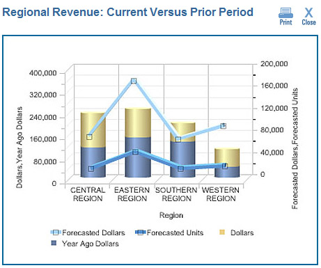
And I will show you why in the second Part of my article on the efficient Dashboard-Design .
Stay tuned,
![]()
_
![]()
This file is licenced under the Creative Commons-Licence.