Visualization: Efficient Dashboard Design (2/2)
In my last post I announced that I would analyze the – how shall I call it – maybe “the worst chart in the world”. Here it is: the origination process from a visual loser to a meaningful visualization.
I think in the first part of my series about efficient Dasboard Design, I was able to demonstrate that the graphical presentation of information is preferable to the tabular presentation.
When it comes to recognizing patterns, trends or outliers charts remain unbeaten. Although tables have their place in reporting – more on this in another post!
Now the point is to show that is not sufficient for efficient Dashboard-Design to position some pie-, column charts or speedometers/gauges haphazardly on a screen page.
The selection of the right chart type and the design of the chart are decisive for the expressiveness of a dashboard. I want to show this by means of an example chart in a step-by-step evaluation.
But first of all I need to confess that I found the chart two years ago in a blog entry by Stephen Few with the title: „Oracle – Have you no shame?“
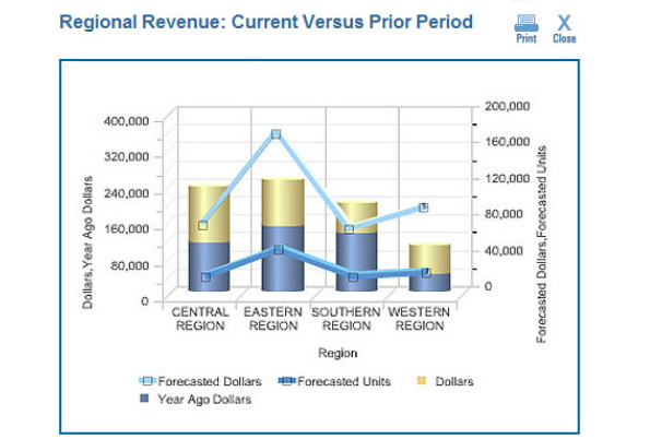
In my opinion it is still probably the worst chart in the world! It seems unbelievable but this chart was – is? – the demonstrative example for the online learning course: “Oracle BI Enterprise Edition – Build Good Dashboards”! Putting it a bit bluntly, Stephen Few sums it up:
“Based on this graph, I’m guessing that Oracle now outsources the development of its courses to the primate house of the local zoo.”
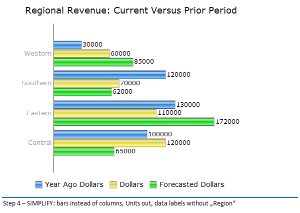
Why? Beautiful 3D- cylinder charts and -lines, which make an interpretation of the underlying data nearly impossible. First of all we will delete this straining after effect along with superfluous frames. You can see the result here, built with standard components of SAP BO Dashboards
(Xcelsius). I needed to perform some sleights of hand to succeed in building the chart of image 2 with Xcelsius:
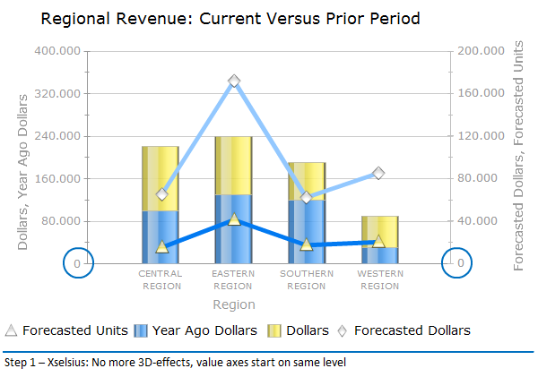
Without the 3D-effects and value axis starting on the same level with “0”, the basic prerequisites for a sensible interpretation of this chart are given. On closer inspection it is obvious that the “Forecasted Dollars” are not shown on the left value axes, together with the other two given values, but on the right value axis, together with the “Forecasted Units”. They can not be serious! All values („Dollars”) are depicted with identical elements – columns – and on the same axes:
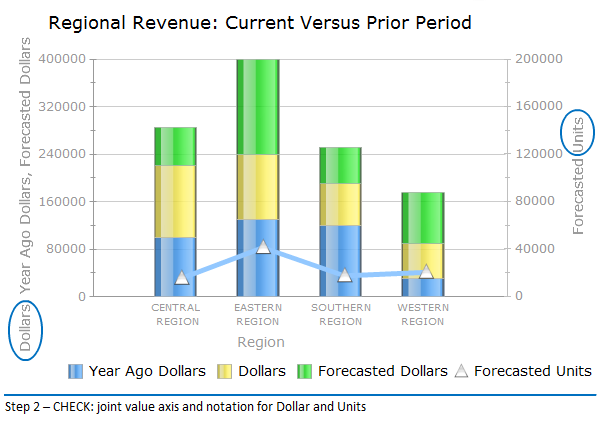
Up to this point I am tolerant as these mistakes are BI-standard. But it gets a lot worse: Who is the donkey responsible for stacking three annual values in order to make them visually comparable?! If I want to compare actual turnover data with data from the last year or with the forecast, I show
them grouped side-by-side:
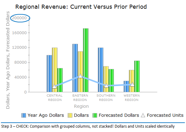
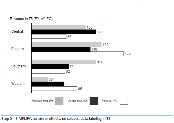
Furthermore, I am able to depict the “Forecasted Units” on a uniform scale with the Dollar-values. I can do without auxiliary lines. I rather prefer the data labels on the elements. I also adopted a rule: I always show development over time on a horizontal axis from left to right,
structural development on a vertical axis. For the comparison of regional structures I therefore prefer a grouped bar- instead of a column chart.
Still rather colorful. The choice of color and color-effects are deviating. Visualization gurus call this “Noise”. My advice is to use colors only if they make sense: to emphasize, as a warning signal or if the color is used to encode information. I know companies which assign certain colors to each
business segment! Red and Green are reserved for “good” and “bad”. Furthermore, charts in shades of gray are easier to print. Another form of “noise” are the 6-digits chart labels: I use three digits as a maximum and scale the chart accordingly:
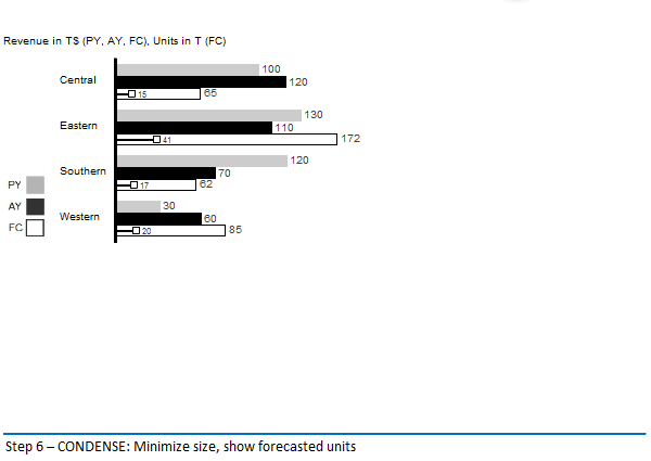
Regular readers of my lines know: I am a fan of the regulatory framework SUCCESS by Rolf Hichert. We have these rules fully implemented in our graphomate Addon for SAP BO Dashboards (Xselsius). After applying the CHECK and SIMPLIFY rules for the scaling and design of the chart, the next step is to apply the CONDENSE rules: The goal is to reach a high density of information in order to depict complex data at a glance. The need to browse through (web) pages hinders the comprehension. On the third page, at the latest, we have forgotten what was shown on the first pages. So: minimize the chart size and put the “Forecasted Units” again in the chart. Shown in a needle chart as to set them apart from the values (“Dollars”).
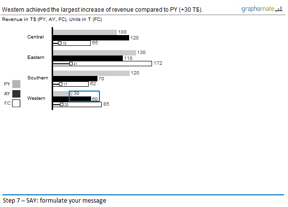
And finally: What is a report without a message? The name of the original chart “Regional Revenue: Current Versus Prior Period” is wrong and meaningless: I can see that it is a comparison of the turnover! Even if I do so at a second glance, as I can also see forecasted units and values.
Each report should have a message, which should be emphasized in the chart:
I am aware that realizing these rules of the SUCCESS-concept – SAY – is rather difficult.
Stephen Few rightly remarks, that:
“It is as if the person who created this “Good Dashboard” example of a graph did everything possible to make it as ineffective as possible.”
Terrible, really terrible, if this is sold as the “best practice” of a BI vendor!
In Part III of my series on efficient Dashboard Design I will talk about the remaining regulatory groups of the SUCCESS concept. Especially UNIFY – the idea of a standardized company-wide notation for business reports – will be a topic.
But for now I am going to eat some watchamacallits …
Pleasant holidays,
![]()
_
![]()
This file is licenced under the Creative Commons-Licence.