graphomate slopegraphs for SAP Lumira Designer
We are pleased to introduce our graphomate slopegraphs extension for SAP Lumira Designer and would like to show how it can be applied.
Slopegraphs were first introduced by Edward Tufte in his book “The Visual Display of Quantitative Information” in the early 1980s. Like their alternative term – table charts – the name gives a good idea of what slopegraphs are about: the data is displayed in a table, but the lines do not only “display” but rather visualize the content.
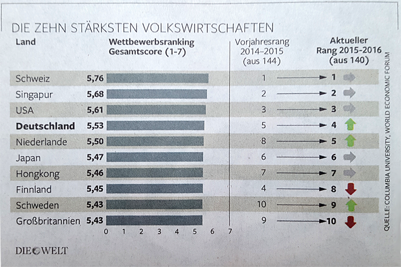
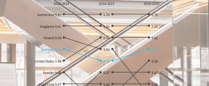
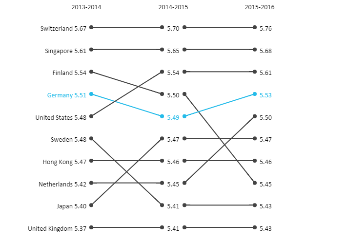
An example for which this visualization type is suitable is shown in the following article from the newspaper “Die Welt”. The enclosed graphic is questionable in many respects: What do the long arrows indicating to the ranks mean (or why are they shown anyway)? Why are the ranks represented? – Without knowing the course of time, they are not very significant. The values shown regardless of any context also have an arbitrary effect. After all, the scale will probably encounter the reader for the first time.
With a slopegraph one can face many of these problems:
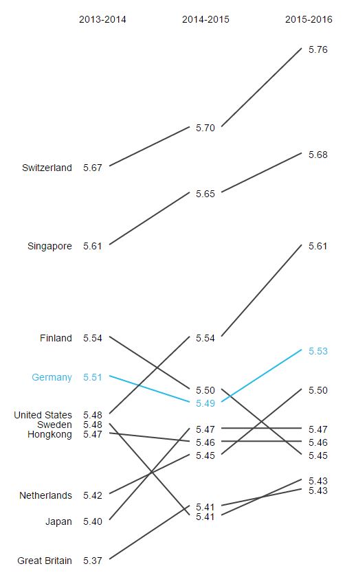
By presenting the values over the years, the context is revealed. The change in the ranks is visually easier to grasp. Highlighting can be used to quickly identify how the situation in the focus country has changed. Last but not least, a higher, visual density is possible: the same information and even additional years can be put in the same place without making it more complicate – in fact quite the contrary.
Highlights
The graphomate slopegraphs are released with some very nice features besides the usual selection possibilities of font, colour, number formatting etc. Some of them will be presented in the following.
Bump Chart: In the settings of the slopegraph is another chart type, the Bump Chart, included. In this visualization type, the slopes are not scaled based on the values, but on the ranges. Therefore, it is possible to visualize rankings and their change over time. In order to distinguish the slopegraphs from the Bump Charts, we have come up with an idea: Round points are shown at the end of the slopes for the Bump Charts to avoid any confusion.
Supporting the scripting language: All properties of the slopegraphs can be read and set via the scripting language. This helps to support the add-ons for interactive dashboards and run-time customizations.
Display of trends and runtime interactivity: In order to better understand whether a slope takes a negative or positive course, trends can be highlighted in colour. The assignment of the colours can be adjusted and inverted. In addition, one can emphasize the course by hovering the mouse via a feature combination at runtime. This highlight is retained by clicking.
PNG export: It is also possible to export the displayed slopegraph as PNG. Previously made highlighting is preserved. The PNG can be used for presentations or can be printed.
If you are interested in a trial version of the graphomate slopegraphs, please contact vertrieb@graphomate.com.
_
![]()
This file is licenced under the Creative Commons-Licence.