
graphomate
chartrix
A new look for our charts
graphomate chartrix is our new charting component. First for the SAP Analytics Cloud (SAC), then later in the year for Power BI, Microsoft 365 and Tableau.
Do you already know and appreciate graphomate charts? Then you will love the graphomate chartrix with its new user interface and several new features.
Learn about the highlights and benefits now – step by step or jump directly to our short chartix video. Please contact us if you would like to be informed about the release of graphomate chartrix.
Development highlights
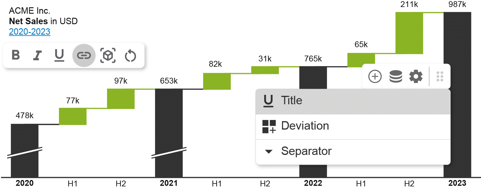
Easy to use
The most obvious change:
The chartrix can now be configured directly on the chart objects.
With context sensitive menus (Overlay UI) we set a new standard for intuitive operation and ergonomics when editing chart parameters.
Chartpicker:
The initial setup of the chart now (also) takes place in the widget. The chart picker, a menu reduced to the essentials, shows which chart types are available, allows horizontal or vertical alignment, stacking and adding percentage and/or absolute deviations, all intuitively with just a few clicks. In the first release, we offer four standard chart types but there is more to come …
Chart Tooltips
Our chart tooltips allow you to visualize an additional dimension on hover without cluttering the chart. The data displayed is in context to the selected element.
Text- and Title Editor
Titles and text can now be replaced, changed, or formatted on the fly: bold, italic, underlined. These changes are even saved permanently. It is now also possible to insert links or dynamic placeholders. This makes it easy to create meaningful titles for charts with dynamic data.
Chart Editor
All chart elements can also be formatted in their context. The selection of elements is freely selectable – from single, to multiple, to all elements. Editing options are adapted to the selection.


New chart typesen
- Line chart with variance visualization
- Deviation waterfall from a data series.
This chart type allows you to easily create a waterfall based on two data series, which shows, for example, the sales trend from 2021 to 2022 by salesperson. - Bars and lines in same data series
- Collapsible hierarchies
(Simply swipe through the different chart types on the left by holding down the mouse button).
We developed graphomate chartrix because our previous charting component, graphomate charts, was getting on in years.
The code base was simply out of date and there was no reasonable way to extend it. The logical conclusion: a new development in which we can combine everything we have learned from the graphomate charts over the past years with a modern software architecture and build on it..
Further advantages of the graphomate chartrix
- XFL Scripting – extend the formatting capabilities of the chartrix with your own scripts
- New chart types – we will be adding new, long-awaited chart types in future releases.
- IBCS or custom design possible
- Performance improvement – large numbers of data series are no longer a problem
- Managing templates between Stories using our graphomate server
The graphomate chartrix – see for yourself!
The graphomate chartrix will be available for SAP Analytics Cloud in Q2.2025.

After the release for SAP Analytics Cloud, graphomate chartrix will be released for MS 365, Power BI and Tableau later in the year.