Land doesn’t generate GDP

I thought I had seen it all when it came to poor, but “sexy” visualizations. But I was proven wrong. Perfect for my TGIF series…
A dear colleague showed me this Linkedin Post last week and I was speechless. Not self-explanatory for me Ralf M. Ruthardt and I feel forced to open a second perspective …
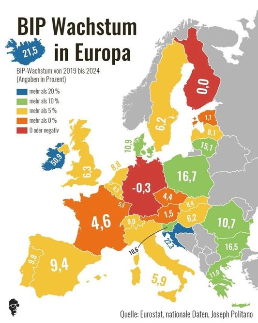
Yet another prettily colored map. This time, the colorful map is supposed to show the change in GDP growth in European countries from 2019 to 2024.
Germany performs worst, of course …
In any case, the figures shown should be questioned. 𝗜𝗿𝗲𝗹𝗮𝗻𝗱 𝟱𝟭% 𝗴𝗿𝗼𝘄𝘁𝗵?
This feeling is reinforced when I compare it with my own quick visualization: the trend of the lines is clearly similar in all countries.

But what is the colored rectangle in my small multiples?
They represent the absolute value of GDP in 2023. Why is that?
Because the absolute starting point is very important for estimating percentage growth:
13% of €563 billion – Ireland’s GDP in 2024 – is a very different figure from 13% of €4,329 billion – Germany’s GDP, which is the 𝗰𝗼𝗺𝗽𝗹𝗲𝘁𝗲 𝗮𝗻𝗻𝘂𝗮𝗹 𝗚𝗗𝗣 𝗼𝗳 𝗜𝗿𝗲𝗹𝗮𝗻𝗱. 😎
Incidentally, this is also why we at graphomate like to show absolute and percentage deviations in our visualizations.
Would you please “like” this post, if you find my visualization more meaningful? Of course, it could be better, but I had to quickly counter this nasty map. I think it deliberately spreads a skewed narrative …
Have a great weekend,
Lars

This file is licenced under the Creative Com