My DataViz heroes (2/5): Florence Nightingale – The Lady with the lamp

In the first part of my blog series on my data visualisation heroes, I tackled the rather shady character William Playfair.
If William was the villain before the Lord, the lady who is to be discussed now was the absolute opposite: an angel – albeit in retrospect a not entirely uncontroversial angel. It is about Florence Nightingale. Perhaps known to some as the founder of modern nursing, but less as a statistician. Florence Nightingale, however, is a pioneer in the visual representation of information. Her Rose Chart is considered a visual milestone.

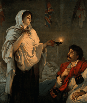
Florence was born in Florence(!) in 1820 as the child of rich English merchants. She had her first divine apparition at 17 and has been on a mission ever since – much like these two gentlemen on the left hand side.
However, she did not bring a band together, but Florence saw it as her God-given task to stand up for the poor and the weak.
Her interest in mathematics and the newly emerging field of statistics also became apparent at an early age. But as a young woman in Victorian England, she could not score points with this knowledge. Her parents wanted Florence to marry a rich, preferably aristocratic man with landed property and have children. That’s it!
However, this was out of the question for Florence: marriage was ‘suicide’ for her. At the age of 25, Nightingale had found her vocation in caring for the sick. She went to Germany to train as a nurse and then took over the management of a hospital in London.
When the English went into the first ‘modern’ war against the Russians in the Crimea in 1854, the desolate state of the English medical service – especially the care of the wounded – quickly became apparent. The English soldiers were dying like flies; the Russian wounded were much better cared for.
Therefore, a friend hers and secretary of state in the War Department sent Florence to the Crimea to alleviate the medical emergency there. There, where she climbed over corpses and waded through excrement, she was quickly mystified by the soldiers as the ‘Lady with the lamp’.
The pioneer of modern nursing insisted on clean rooms with fresh air, washing hands and changing bed linen regularly, as well as a balanced diet.
In fact, the mortality rate of infected soldiers dropped from 40 to 2 per cent due to the tireless efforts of her team. However, she herself was rarely involved in the direct care of the soldiers, but worked as an organiser in the background. But the ‘Nightingale’ myth was born.
To prove the success of her measures, which we take for granted today, she prepared tables and diagrams. As an enthusiastic – and devout – statistician, she pushed for the inclusion of statistical methods in nursing.
She incessantly ‘bombarded’ politicians with statistics, analyses and proposals. You could also say she was annoying:
‘To understand the thoughts of God, we must study statistics!’.
Florence Nightingale
Her best-known visualisation is the so-called Rose Chart of 1858: a polar area chart that shows data arranged radially. Nightingale may not be the inventor of this chart type, as is repeatedly rumoured, but her use of it is legendary.
Nightingale visualises the causes of death of the soldiers in the military hospital in Scutari with her Rose Chart. She is not interested in illustrating exact values, which she provides in ‘attached’ tables, but in highlighting the importance of her medical work in the Crimean War.
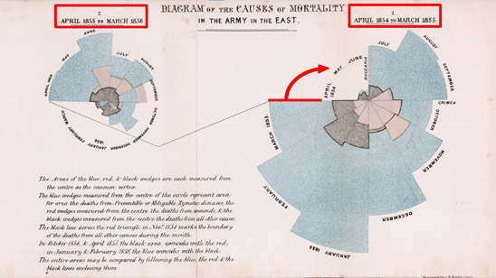
However, the interpretation of the Rose Chart is quite difficult:
- The reading flow from right to left is unusual: The large diagram on the right shows the year 1854. The small diagram shows the following year.
- The months are plotted starting with the month of April ‘from 9 o’clock’.
- The data is NOT shown stacked on top of each other.
- The Rose Chart is NOT a pie chart, the angles are identical!
Nevertheless: a very convincing visualisation. It’s immediately apparent how many more soldiers died of preventable infections (blue) than of battle wounds (red) and other causes (black) in the military hospital: the blue area on the left is much smaller.
Michael Friendly – a historian – already sums it up in this quote:
‘Rather, she was arguably the first to use this graph for political persuasion and popular impact – the graphic message hits you between the eyes.‘
Source: Michael Friendly, The Golden Age of Statistical Graphics, S. 12
And that was exactly the purpose of this visualisation: to convince people to approve funding for care in order to reduce the number of deaths from infections. With today’s technology, this chart combo would have made it into any PowerPoint presentation.
However, as a dashboard and report designer, I am not a fan of circular charts. Nightingales’ Rose Charts does a fantastic job of getting the ONE message across clearly, but a closer analysis of this type of chart reveals how badly the data is distorted. The journalists at The Economist also see it this way, which is why they have completely banned polar charts and instead use only bar charts:
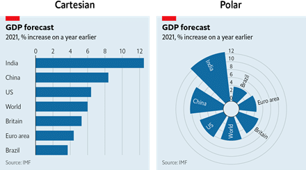
This example clearly shows how strongly Polar Area Charts distort the visual impression. As the circle segments ‘grow outwards’, large values appear strongly overdrawn: The value for India in the Polar Chart on the left is visually ~8x larger than that for Brazil. In reality, however, it is ‘only’ larger by a factor of 3.
Source: https://bit.ly/3iEIsaZ
Nightingale has cleverly exploited this effect.
Nevertheless, these ‘tricks’ have no place in regular reports or dashboards. Especially as these are not about the ONE message, but about a basis for comparisons for pattern, trend and outlier detection as a basis for decision-making.
What would be an alternative visualisation? Of course – as you might have guessed – simple columns with deviations. Here is an example – created with our graphomate charts.
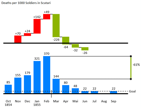
Data source: https://www.dataplusscience.com/NightingaleRedesign.html but without a breakdown of the causes of death.
A special feature: I present the deviations cumulatively in the form of a waterfall, which makes the effects of Nightingales’ measures from March 1855 directly visible – additionally supported by the percentage highlighting.
But back to Florence Nightingale:
Severely chronically ill and bedridden, she returned from the Crimea, devoted herself to writing, her enthusiasm for statistics and data visualisation, and founded England’s first nursing school in 1860.
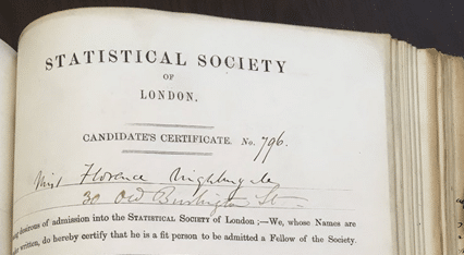
Because of her services to statistics, she was the first woman to be admitted to the Royal Statistical Society in 1858.
She died at the age of 90. In her honour, 12 May, her birthday, is now International Day of Care.
Nevertheless, there is also criticism of Nightingale as a person. Some historians set out to sweep the British national saint off her pedestal and described Nightingale as a frustrated megalomaniac, misogynist or racist. In 1998, the Briton Hugh Small even called her an ‘avenging angel’. As always, the ‘truth’ lies in the middle.
In the next part of this series, I will stick to round, circular representations and the author of the first book on the question of choosing the right chart: Willard C. Brinton.
Stay tuned
Lars

This file is licenced under the Creative Commons-Licence.