My DataViz heroes (1/5): William Playfair – the criminal genius

I had – let’s say – a bit more time on my hands last year. Lecture tours and customer visits were cancelled and our regular webinars were limited to the presentation of our new developments for SAC, Power BI and Tableau.
An offer from SAP to give a talk at the SAP Analytics Forum in the autumn came at just the right time to reactivate my grey matter.
But … what should I talk about – besides the other, purely technical contributions?
I already had presented my typical visualisation talks at similar events in recent years.
Is there something like an extract from my 20 years of involvement with the topic of “data visualisation” and if so, how do I present it in an exciting 45 minutes?
The idea was quickly born to interweave my DataViz topics with the history of personalities important to me, to make the whole thing a little more exciting.
So here is the first part of a series of five blog posts on my heroes* of data visualisation:
- William Playfair – the criminal genius
- Florence Nightingale -the lady with the lamb
- Willard C. Brinton – the unknown pioneer
- Edward Tufte – the information design Guru
- Rolf Hichert – the man for a few standards

Ok, let’s start with the most dazzling personality – the bad guy – of my datavis heroes: William Playfair.

William Playfair’s approach to life – and his life’s journey – is probably best summed up in his own words:
„Where there is no danger there is neither gain nor glory.“
William Playfair, March 20, 1793
William was born in Scotland near Dundee in 1759.
As his father died early, he was brought up and taught by his elder brother John – a well-known mathematician. Through him, he also had early contact with the intellectual greats of the Enlightenment. It’s said, that Adam Smith – the father of market economics – was a regular guest with the family.
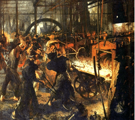
At 17, William became an assistant to James Watt, the inventor of the steam engine.
However, he saw himself called to higher things and in search of the big money.
Three years later, he moved to London, where he founded a silversmithing business with a partner. After all, he had several patents in metal processing by then!
However, the silversmithing business went bankrupt a short time later under rather dubious circumstances.
“In a pattern to be repeated many times in the coming years, Playfair had embarked
Ian Spence and Howard Wainer, 2005
upon a speculative scheme that was doomed to failure.”
http://www.jstor.org/stable/27643669
The first indications of his, shall we say, “special” character became apparent.
Afterwards, William turned to writing about economics. And now it gets exciting.
His second book, The Commercial and Political Atlas of 1786, was to prove a milestone in data visualization – albeit not until many decades after his death.
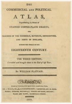
Although titled an atlas, it did not contain a single map. Instead, it contained 43 line charts and one bar chart.
The world had never seen anything like this: William had just invented line and bar charts.
Just imagine: in an age without computers, with books full of tables, William sits down after a disastrous failure and revolutionises the presentation of information – using only a pen and a ruler.
In terms of content, the atlas deals with England’s foreign trade and explains England’s import/export surpluses with various countries.
The French King Louis XVI received a copy of the atlas from an English politician and friend of Playfair. The king, seeing line charts for the first time, was delighted:
“[the king] at once understood the charts and was highly pleased. He said they spoke
Playfair, 1822
all languages and were very clear and easily understood.”
However, when the atlas did not bring the fame and financial success he was seeking, Playfair left London for the mainland. William’s first stop was indeed Paris, where he used his knowledge of metalworking to plan a rolling mill and seek investors.
Louis XVI heard of this venture and took a stake in Playfair’s company by contributing a property. He didn’t have much „cash“ at the time …
At the time, Louis certainly had no idea that Playfair would later make a name for himself as a spy in Her Majesty Queen Victoria’s secret service against France.
The rolling mill never got off the ground either and Playfair was involved in some terrible economic scandals, so that he was forced to leave France shortly before the Terror of 1793.
Over the next few decades he worked in half of Europe as a spy, investment broker, political economist, publicist, property speculator and banker.
Even back in England, he was accused of fraudulent activities and often narrowly escaped prison. At the end of his life and quite broke, he tried to blackmail the richest man in Scotland – Lord Douglas. This also went completely wrong: the supposed evidence papers probably never existed.
In short, he was a brilliant rogue whose graphic inventions, however, received little or no recognition during his lifetime. There is even an exciting biography about his life by Bruce Berkowitz: “Playfair: The True Story of the British Secret Agent Who Changed How We See the World”.
OK, dazzling personality our William, but why are line and bar charts in his atlas so particularly significant to me?
Well, first of all, these graphical representations simply did not exist. No one had ever thought of representing import-export data graphically before.
One only knew tables, which were anything but easy to interpret in these times. Comparing the data or recognising a trend over several tables was hard work.
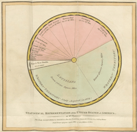
Have a look at an example from Playfair’s Atlas:
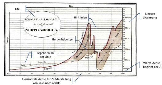
What a great idea from Playfair to bring import-export data into a coordinate system using two line charts … and in such high quality – all guidelines of good datavis can be found in his graphics.
Within seconds we can see a trend and the collapse in the 1770s. An event impossible to spot in a table! Of course, the question is: what happened? Well, the American War of Independence had broken out. Not necessarily the best conditions for good trade relations.
In summary: Charts help to quickly and sustainably recognise patterns, trends, outliers and other correlations in data. A table has to be read and processed intensively by our „eye-brain-system“.
That’s why we like visual tables at graphomate. These are tables that are enriched with visual elements to better interpret the information they depict.
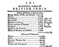
Let’s take a typical table layout from Playfair’s time. In the original, the table on the left is spread over several pages of a book. The table on the left shows only the first half of a page.
You read the rows, have to remember the data and calculate in your head to get an idea of the proportions.
If, on the other hand, we take these data – as well as other data columns – and visualise them with our graphomate matrix, we get the following picture:
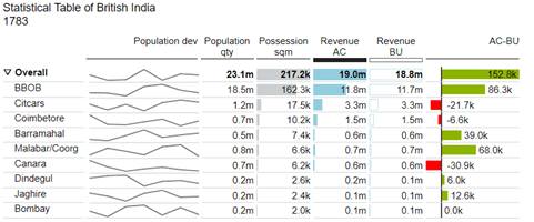
Ok, I have met CFOs who stared at tables on walls and extracted the important information from them at breathtaking speed. But I think it is clear that the presentation of data in tables enriched with sparklines, bar charts and other visual elements creates a better and faster overview and insights than purely numerical wallpapers.
And last but not least: decades after the atlas, Playfair also invented the pie chart.
A rather controversial type of visualisation: beautifully round and eye-fancy. 🙂
We “love” round visualisations, although they are demonstrably more difficult to understand than bars.
More on this in the next part of my blog series, which is about Florence Nightingale and her famous Rose Chart.
Stay tuned
Lars

This file is licenced under the Creative Commons-Licence.