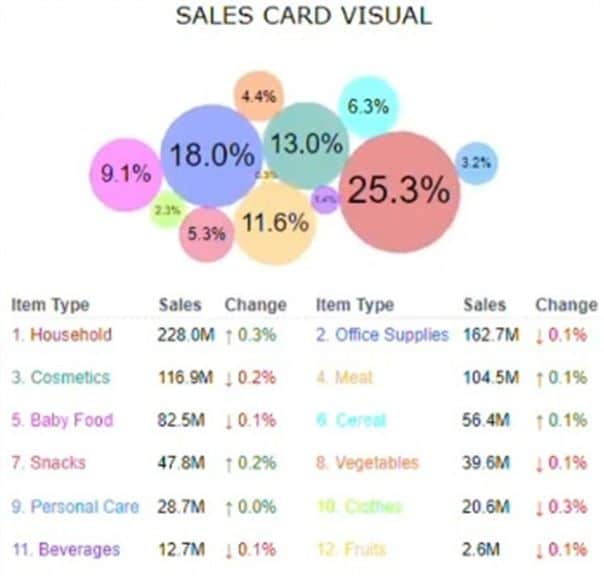
Beautiful, colorful bubbles

On the left you see a sales card visual for Power BI with a table for detailed data underneath.
It’s meant to be an “experience where users can effortlessly explore sales patterns and extract meaningful insights.”
I think, it’s a nice visualization – but difficult to understand IMHO.
The bubbles have to be brought together with the colored product group names via “eye ping-pong”. That’s really not easy …
And I always ask myself if the part-to-whole value is really that important?
I think a simple ordered table – like the one on the right – with some visual support for showing quarterly trends and previous year deviations is much easier to perceive … and it shows much more information in the same space.
I built this table in Power BI 5 minutes using our graphomate matrix for Power BI.
However, it took me more than two hours to generate the database from the Sales Card Visual.😊
sales card visual for Power BI with a table

Visualization with graphomate matrix
What do you think?
Have a nice weekend, Lars
PS Unfortunately I lost the link to the original linkedIn post, sorry ☹

This file is licenced under the Creative Com