It’s the message, stupid!

Todays Goody I Found is about the mother of modern nursing and a famous statistician: Florence Nightingale on of our DataViz heroes.
Florence Nightingale was sent to the Crimea in 1854, where the Crimean Wars were raging. The conditions in the English military hospitals were very desolate and many wounded soldiers died.
There, she simply insisted on washing hands, clean rooms with fresh air and changing of bed linen regularly, as well as balanced food. In fact, the mortality rate of infected soldiers dropped from 40 to 2 per cent due to her tireless efforts, but she needed more money.
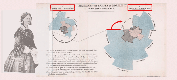
She permanently “bombed” politicians with statistics, analyses and proposals. Especially one chart made her a pioneer in the visual representation of information: the so called Rose Chart.
It’s a Polar Area Chart that shows data arranged in circles:
It’s NOT an easy-to-read chart, but it’s a very pleasing – round – visualization and the message “hits you between the eyes”: It’s immediately apparent how many more soldiers died from preventable infections (blue) than from battle wounds (red) and other causes (black) – and that the number of deaths from infection decreased with her hygiene measures.
This is a perfect visualization with only one purpose: to convince people to act based on the visualized fact. It serves only that purpose: Give me more money to make my Job! I can see the PowerPoint slide before my eyes …😊
Does that mean we should use Polar Area Chart in our regular Reports and Dashboards?
I don’t think so: We should use simpler and known chart types, because we don’t know the message in advance. Reports and Dashboards do not convey any message, Presentations do!
I made an alternative visualization by using simple bars.
It’s easier to understand and different details become apparent:
Do you prefer Polar Area Charts – they look so good – or would you use simple bar charts?
Have a nice weekend
Lars

This file is licenced under the Creative Com


