Simplify: Dashboards and Alcohol
It was pretty quiet here the last few months: too much going on, not enough spare time! That will change again. Now I am proud to announce the first guest post on this blog. Wonderful entry! Thanks, Manu.
Imagine you had a hard work day and want to end it in your favourite bar. The waiter brings you the list of beverages to choose from. You may decide between

and
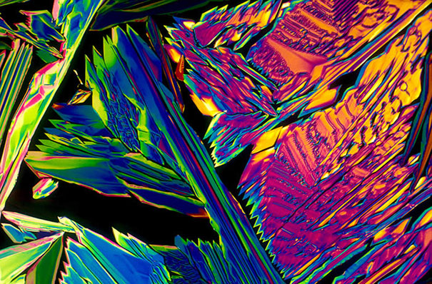
You chose a cool bar: instead of easy to understand descriptions or photos you are presented with pictures of your favourite drink in their crystallized form, viewed through a light microscope, so called bevshots. Not so easy, is it?
At first glance you might think: “Wow, beautiful colours”, but: Where is the information? To find out what you are actually ordering you either need to ask the waiter – and face the embarrassing situation that recognizing your favourite drink in its crystalline form is not among your strength – or try your luck and order what seems to be most beautiful picture.
Many modern dashboards are designed likewise: pretty and colourful, with confusing graphics and senseless features – in these dashboards the analysis of data has also something to do with trying your luck. Bright colours, senseless features, wrong scaling distract the beholder from what is essential: dashboards are a tool for decision support.
Take a look at an example for a “vivacious” dashboard – with a just as colourful as confusing design. The beholder must adjust to different shapes, colours and reading directions:

Dashboards made with the graphomate addon look different: simple, with only few, accentuated colours they offer a wealth of information on a limited space – simply clear:
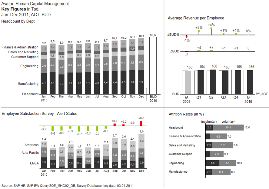
They might not be colourful and lurid, but they help the decision maker to be better and faster with the analysis of the data. Therefore, dashboards made with the graphomate addon comply with one of the most important SUCESS-Rules: Simplify. Everything unnecessary like colour-effects, 3D-effects and so on is omitted and thus enables the beholder to have a better understanding of the data.
The importance of efficient dashboard design has been discussed in depth by Lars many times in this blog; take a look here or here.
Applying these rules may give you more time to order ![]() or this
or this ![]() , which are the drinks behind the bevshots from above.
, which are the drinks behind the bevshots from above.
All the information I need – at the first glance. What do I need more?
Cheers,
Manu
_
![]()
This file is licenced under the Creative Commons-Licence.