Seeing, not reading!

This week “The Goody I found” (TGIF) is about KPI Cards in Power BI.
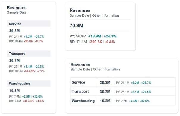
Gustaw Dudek shows some small-multiple layout alternatives of the KPI Cards in Power BI, as shown in the picture below left. Nice feature: simply breakdown a KPI Card after a dimension such as business unit or category.
Generally, I’m a big fan of small multiples: they increase the information density, provide context and enable quick comparisons. However, there is something crucial missing in Gustaw’s examples below IMHO:
there are no visual elements!
Basic key figures, deviations from previous year and budget must be read and cognitively processed in a time-consuming process. The changing number formats (M, K) makes it even harder to understand.
Why not integrate visual elements into the KPI cards, such as bars and needle diagrams for deviations or lines to visualise trends in the basic key figures?
I did a quick design based on different data with our graphomate matrix, using sparklines, background bars and deviation visuals. I think this is even more information condensed in a small space but still easy to read.
And it’s possible to do detailed analysis by clicking at a data point of course …
Am I right?

Visualization by graphomate matrix
Have a nice weekend
Lars

This file is licenced under the Creative Com