Visualization: My breakfast in Spain
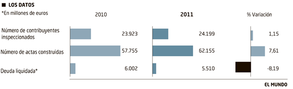
I had the pleasure to roam about Madrid last month as I was attending the SAP TechEd, trying to keep myself informed about the newest developments at SAP. My hotel only offered Spanish newspapers as reading material during breakfast. It is true, I don’t have a good command of the Spanish language, but the visual language of charts is universally applicable. A diagram in El Mundo appealed to me. I found the following chart in the financial section of the newspaper „El Mundo“ in the issue of 12 November 2012:
I was surprised and, at the same time, enthusiastic!
Although I did not really understand the topic, the choice of the chart type and the arrangement of the diagrams correspond in a nearly perfect way with my ideas of good visualization of information.
Unfortunately, this is only true on first sight. Then I took a deeper look into the matter.
Spain seems to have the problem that taxes due are not paid and that the country’s liquidity is endangered. If I understand the message of the chart – which, unfortunately, is missing – correctly, a greater number of taxpayers has been reviewed and more tax assessment notes have been issued in 2011 than in comparison with 2010.
Nevertheless, the sum of collected taxes is declining. So far, so bad – for Spain.
But back to the visualization. What do I like?
- Choosing a horizontally aligned bar chart instead of a pie chart: chapeau, this is a rather rare choice for print media
- I really like the comparison between actual and pre-year figures and the deviation shown in percentage.
- The most important number, “– 8.19%”, stands out.
- The whole thing is made simple and in a reserved graphic style – no colorful junk.
So, what do I not like:
- An absolute no-go: The visual comparison of the bars is impossible: the absolute values of the years are scaled in a different way. This leads to the effect that the bars for 2011 are shorter than those of 2010 – although the values of the first two bars are higher.
- Are data labels with 5 digits, or rather with 3 fractional digits really necessary?
- Data labels are far away from the corresponding bar elements.
- To which year refers “%-Variación”?
- Missing title concept and message.
And anyway: Are previous year figures interesting or only the difference to these figures?
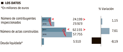
I tend towards not showing pre-years figures in a prominent way. Last year is yesterday, too late now, over. Therefore, hint at these figures – in this case with grey bars in the background – and only emphasize the difference to the pre-year figures. Making the whole diagram less “heavy” leaves you more place for information:

Besides, I differentiate between quantities and values by using “thicker” bars for the number of reviewed taxpayers and the issued tax assessment notes. Percentage deviations are shown with needles to differentiate them from absolute values. The grey axis shows that the percentage deviation in the diagram refers to the year 2010.
Finally, some advertisement: our new version, which will be released in December, enables the depiction of percentage deviation with circular elements – with a simple mouse-click. By the way, I created the whole diagram in a few minutes with our graphomate Addon.

In Principle, our eye-brain vision system is better in assessing length than it can assess circular elements: which is one of the reasons for the omnipresent dislike of pie-charts…
But the red circle is a nice “alarm” signal ,therefore, in this special case I would prefer circles to needles. There is also enough space to visualize the change from last year 2011 to the actual year 2012: So I show the predicted values for 2012 in comparison with 2011 by using shaded circles on black axis- although the values are fictitious.
I would be a fan of such a notation which should be used continuously in a newspaper. It requires a settling-in period, but our clients from the industry and commerce manage it, too.
Good for me that Madrid showed itself from its best side concerning the weather: I could jog through the Retiro Park in the morning instead of further trying to decrypt Spanish newspapers.
And furthermore, my Vitamin D balance is steady and I can stand the grey-in-grey here in the North better.
Cozy winter evenings to everyone,
![]()
_
![]()
This file is licenced under the Creative Commons-Licence.