Nothing is certain, except death and taxes

Germany goes to the polls in 3 weeks and today’s Goody I Found (TGIF) is all about the parties’ election promises on income taxation.
Together with the Centre for European Economic Research (ZEW), the Süddeutsche Zeitung (SZ) has calculated the impact of the parties’ election campaign plans on disposable income.
In my last post I ended with an appeal for comparisons in dashboards. The example of the German parties and tax ideas is a wonderful one: six parties and the effects of their tax plans in comparison.
In the first step, I modelled and visualised the data from the study in Power BI:
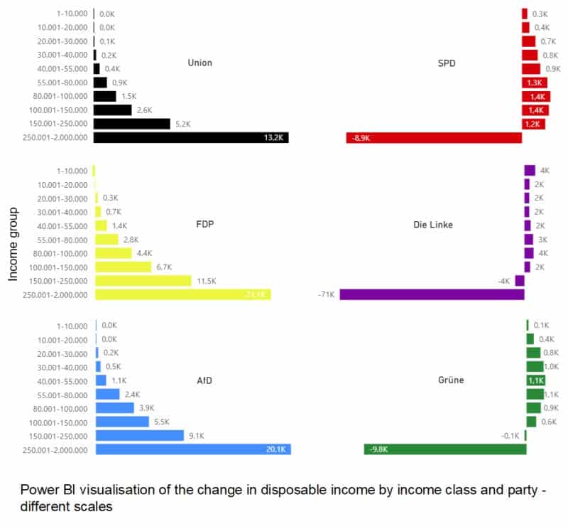
You can see the change in disposable income by income group if each party implements its ideas.
No political comment from me here … 🤨
So, can you compare the figures visually?
OK, the highest income group in particular seems to be treated very differently by the parties. Further comparisons are rather difficult because the charts are not comparable: the scaling is different.
Power BI uses all the space available for the bar charts.
I then visualised the data with our graphomate charts and simply scaled them identically with our ‘comparison group’.
Now we can compare the ideas of the German parties.
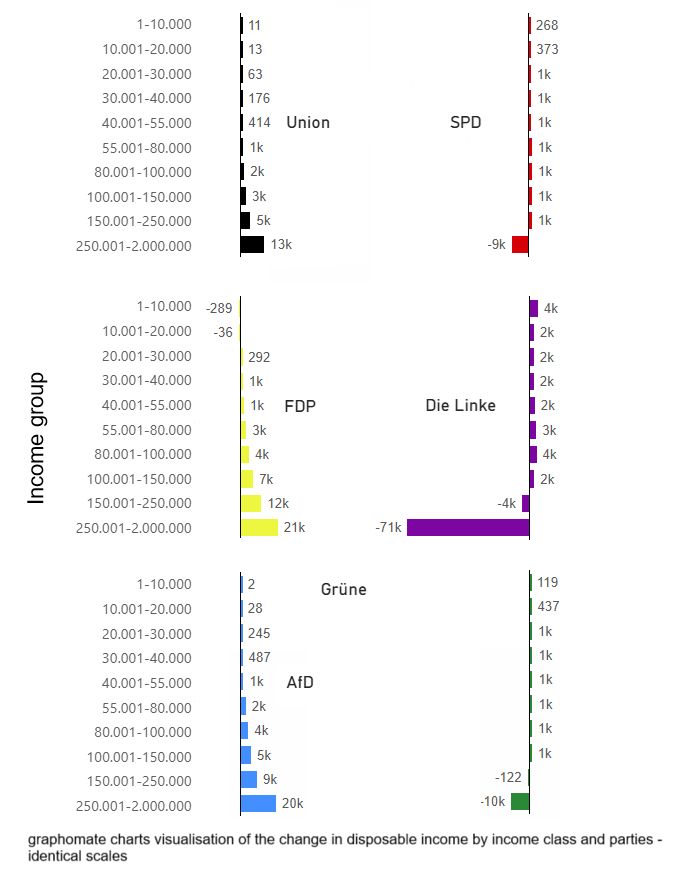
I find my graphomate visualisation much more meaningful.
Perhaps the high burden on the highest income group proposed by the Left Party could be shown as an outlier? What do you think?
Have a nice weekend
Lars
By the way: only the Greens’ ideas seem to be basically affordable. All other programmes are heavily criticised for their financial viability.

This file is licenced under the Creative Com