No, not 3D again?!

Today’s The Goody I Found (TGIF) arrived in an envelope in our office: an advertising brochure for a German CRM/ERP system for the IT industry.
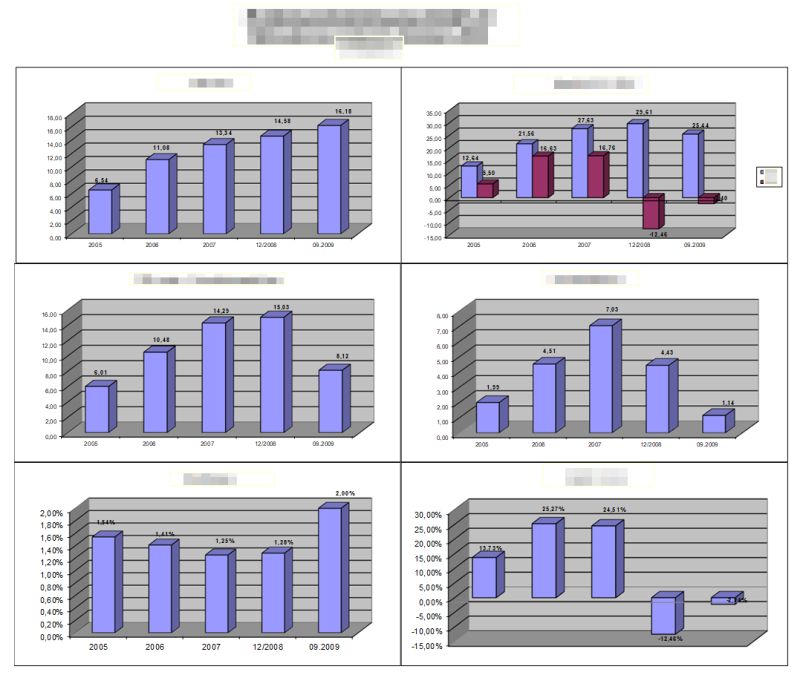
You can find the scan of an example report in the brochure below – sorry for the poor quality.

I felt like I’d been transported back to the last millennium: 3-dimensional bars, ellipses and the ever-popular sales funnel. Is that still on dashboards in 2024? 🤔
OK, upper lip beards with seventies bar glasses are also back in fashion, but I thought we had really left 3D visualisations behind us.
I remember back in 2009, when I was confronted with a report at work and had just read Edward Tufte’s book ‘The Visual Display of Quantitative Information’ form 1983(!).
A beautiful and recommendable book, in which Tufte formulates the data-to-ink ratio that needs to be minimised: use as little ‘ink’ – or pixels – as possible to visualise data points!
The aforementioned report is shown below: Six bar charts showing various key figures, ratios and margins. All using the same Excel 3D elements and ‘somehow’ scaled. Axes with auxiliary lines, grey backgrounds and different font sizes complete the picture. In any case, no minimal data-to-ink ratio!
Of course, I had to get to work and come up with a redesign.
My simplified version is scaled the same for absolute figures – so they are visually comparable. I have put comparable figures that belong together in one chart. Percentages and margins are illustrated with different pin charts that are NOT scaled the same. I got rid off value axes, auxiliary lines and backgrounds.

This minimises the data-to-ink ratio and I think the readability is much better.
I hope you agree with me … 🙆
Have a nice weekend,
Lars

This file is licenced under the Creative Com