BCG Matrix with graphomate bubbles

In a former blog post we already wrote about our graphomate bubbles in general. Today we would like to examine a specific use case: a dynamic BCG Matix usable as a filter element.
The graphomate bubbles are able to visualize 5 series of data in one graph. This is why they stand out from “standard” bubble charts, because those are only able to handle a maximum of 3 data series. The first two values from the x- and y-axis data series are mapped in to a cartesian grid. The third data series is depicted as the area of the individual circles. The highlight is the possibility to represent a fraction of the value for the circular area as a circular section. This is formed from the fourth dimension. In addition, the deviation from the values of the fourth data series to the values of the fifth data series is formed and represented as a further circle segment. Thus, more data can be displayed without additional diagrams.
Further highlights of our bubbles are the completely freely configurable grid, the trend line and additional lines, e.g. target values and areas marked by coloring.
But now to the BCG matrix …
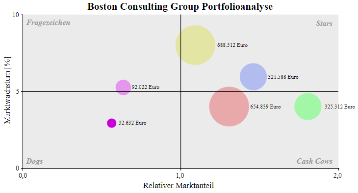
The BCG matrix is a type of diagram developed by the Boston Consulting Group that is used to plan the company’s strategic orientation. The company’s products are presented in a matrix in which the relative market share is compared to the real, future market growth. At the same time, the circular area is used to visualize the turnover of the respective product. This portfolio divides a company’s products into four categories: Question Marks, Stars, Cashcows and Poor Dogs.
Sales programs can then be developed from this product portfolio. Depending on the classification of the product into the four categories different strategies are used.
Question Marks
These are newly introduced products. As a result, the market share is low and the growth potential for the market is large. The market share of these products should be selectively increased by the use of liquid funds.
Stars
These products already have a strong share in a still growing market. At the same time, they are able to generate the necessary investments to use market growth. Instead of these investments, however, a levy strategy can also be used, in which the contribution margin are increased without jeopardizing the existing market shares.
Cashcows
The market for these products is still very weak. Therefore, no further investment is useful to follow market growth. At the same time, these products offer a long-term stable source of income. A fixed or reduced price makes it possible to compete in the competition.
Poor Dogs
These products are to be discontinued soon. Market growth is low, and there is even some market worsening. In these products no investment should be made. As soon as the contribution margin is negative, the product should be discontinued.
Presentation with graphomate bubbles in SAP Lumira Designer
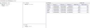
If the graphomate bubbles are installed, a data source is needed, in which the data required for the BCG matrix is available, i.e. the individual products are divided into at least 3 series: a series for the relative market share, one for the market growth and another for sales. If you do not have such a data source, you can use the following CSV: BCG data download
1. Import data source
Unpack downloaded file. In Design Studio, right click on “Data Sources”. “Add CSV Datasource” and select the “BCGDaten.csv” file from the unzipped folder.
2. Change Initial View
Right-click on the created data source and click “Edit initial view”. Drag and drop the “Category” into the “Rows”. Right click “Category” in the “Rows”. Set “Member Display” to “Key” and “Totals Display” to “Hide Totals”.
The Initial View should look like this:
3. Create Bubbles
Drag and drop “graphomate bubbles” to the canvas. Drag and drop the data series onto the visualization that now appears.
4. Assign data
Click on the “Additional Properties” tab and then on the “Data” tab. For the “X Axis” select “Market Share” by clicking on the three points. Select “Market Growth” for the “Y-axis”. The “CircleData” is formed from the series “Revenue”.
5. Change the axis labeling
In order to make it clear that the values on the axes are percentages, the axis labeling should be changed. In the “Data” tab on “Manual Series Labels”, the usage of the manually defined axis labels is activated by checkbox. In our example we enter the same text that is already automatically displayed and add “in %” to it.
6. Display four quadrants
Deactivate automatically generated lines in the “Helper” tab under “Inner Gridlines”. Manual grid lines are generated by entering “2” as the value for “Steps X Axis” and “Steps Y Axis” under “Additional Grid Lines”.
7. Limit the values
Switch to the “Behaviour” tab and deactivate “Full Boxes” under “Scaling”. Set “Begin of X Axis” to “0”. Set “End of X Axis” to “200” and activate both. Set “Start of Y Axis” at “0” and “End of Y Axis” to “10”. Activate both as well.
8. Display further measured variables
Compared to the series “Revenue” the profit of the year 2015 and additionally the comparison to the profit of the year 2014 is to be represented. To do this, select “Profit 2015” as a series for the “Arc Data” 2015 on the “Data” tab and “Profit 2014” as the series for the “Deviation Base”.
The diagram should look like this:
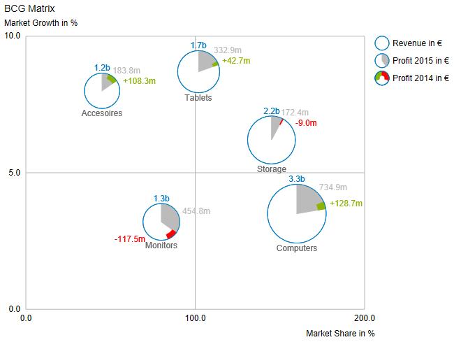
It is now clear in which quadrant of the BCG matrix the products are located. At the same time, it is possible to see from the area of the circles what turnover the products generate individually. In addition, the profit for 2015 will be presented as a share of sales and the change in profit compared to 2014.
The whole thing again as video:
You are currently viewing a placeholder content from Default. To access the actual content, click the button below. Please note that doing so will share data with third-party providers.
It should now be apparent that with our bubbles it is possible to achieve a higher data density on the same space and to enrich the visualization with additional optical elements.
Have fun trying it out!
Daniel
_
![]()
This file is licenced under the Creative Commons-Licence.