I prefer calculating
Pie charts are a popular target for many supposed visualization experts. And that is how it should be! However, this guest post by Manuel Sedlak sheds some new light on the pie chart.
In literature pie charts are often criticized and described as unrewarding, but is that true? Can some issues be answered even easier and better with a pie chart – e.g. percentage compositions?
To answer these and other questions, I examined different diagrams using eye-tracking tests in my master thesis. In these tests the eye movements of subjects are recorded to recognize when and how intensively elements were looked at.
In one experiment a pie and a bar chart were displayed simultaneously to the participants with the information that the two charts show exactly the same values. Based on these charts, the participants should answer what is the percentage of sales employees.
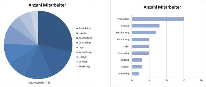
The expectation was that the participants try to solve the issue using the pie chart, by first looking for sales in the pie chart and then try to identify the percentage of sales. This way the approximately correct value of 6 percent could be determined.. As the heat map shows, the issue has been solved in a different way:
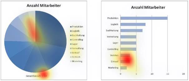
The heat map shows the points that were viewed very often. Although there is a spot on the sales in the pie chart, which was expected, there are also other, more intensive spots. To come to the solution also the bar chart and the total number of employees at the bottom of the pie chart were considered.
The heat map and the statements of the research participants show that there were difficulties in solving the problem with just the pie chart. Instead they chose a more complex method and calculated the percentage. This becomes particularly obvious by the comment of one research participant who complained during the task that he has to do mental mathematics.
In conclusion the subjects were unable to solve the problem and find the percentage on the basis of the pie chart. However, this does not mean that a pie chart should never be used.
Rather, it is important to design the pie chart as simple as possible and therefore easy to read:
- Clear gradations of the different sectors
- Category labels next to the sectors instead of a legend
- Show data labels – percentage % and/or absolute – according to the question
These measures will make the pie chart easier to read.
The pie chart is best suited for presenting percentages of a whole. But the number of categories/sections should be minimized. If more than 3 sections should be shown, we recommend the use of a bar chart.
graphomate integrated pie charts as micro charts into its add-ons for SAP Design Studio to show the percentages visually clear and by doing it adding a benefit to the users.
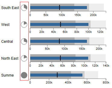
The graphomate bullet graphs will enable the visualization of percentages in the form of a pie in the next release:
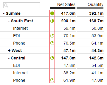
However, the graphomate tables already have the possibilty to use micro pies with just one mouse click under Exceptions/Alerting:
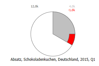
In the new add-on graphomate tiles, being released in two months, there will be a module with a mini pie chart that can even display deviations:
For me, the pie is quite an important chart type in the tool box for visualizations – as always, it depends on the context and the demands of the addressee.
The best,
Manuel
PS:
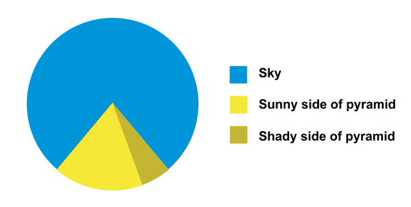
This beautiful pie chart came to me via twitter at the end of last year.
 About the autor:
Manuel Sedlak work as an SAP Consultant at CIBER Managed Services and is focusing on the issues of SAP Business Objects, SAP BW and SAP HANA. As part of his Master’s thesis he developed design paradigms for visualizing data and showed the results of his research in visualizing a dashboard in Design Studio.

