Visualization: When colours make you blind
„Everything is so beautifully colorful here.“ German punk icon Nina Hagen sang this song at the end of the 70s and referred to color TV. Some producers of dashboards still try to comply with this maxim of using as many colors as possible.
 Source: perpetuum software
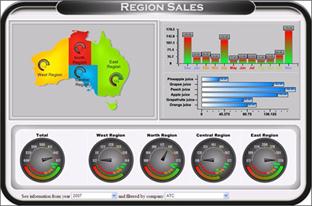
The example from above shows a kind of dashboard which is still a favorite with many dashboard designers – extremely colorful, with gaudy colors that seem to leap out at the beholder and many different style elements like a map, gauges and so on.
But what happens to all the colors if the addressees are not able to perceive all the colors? What if the suffer from a kind of red-green color blindness? About 9% of all male and around 0.8% of all female are affected by this genetic deficiency.
An easy test shows how color blindness affects the perception of the dashboard from above.
 Quelle: http://www.etre.com/tools/colourblindsimulator/
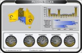
You can see it at a glance – all the colors are meaningless: the map shows only 2 yellow areas, one blue and one yellowish-brown area instead of 4 colorful areas.
The gauges at the bottom of the dashboard have lost their meaning, too: you cannot make out which part is positive (green) and which part is negative (red) because everything looks yellow.
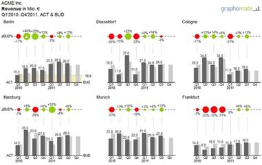
The same test done with a graphomate dashboard leads to the following result:
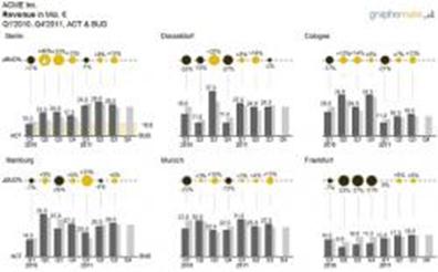
The “colourblindsimulator” unfortunately delivers only graphics with a low quality but nevertheless you can see that the graphomate charts without noise, effects and so one can be „deciphered“ even if you have a red-green color deficiency. The content is not blurred by meaningless colors which cannot be perceived by the beholder. You might give the addressee a hand by stating that the light bubbles are positive and the dark bubbles are negative- but all other information can be seen at a glance and do not need further explanation.
This is an important point for graphomate : it shows how important it is to strictly adhere to the SUCESS-rules: Superfluous components like gaudy colors are left out and therefore do not distract from the fundamental purpose of a dashboard: information. Reducing the noise enables high information density in a small space.
Maybe it is time for dashboard designers to follow the trend shown at the OSCARS of 2012. The winner of the category „Best film“ was „The Artist“ – a black and white film.
The best, Manu
P.S.: Thanks to Markus Reinke for providing the link to the colourblindsimulator.
_
![]()
This file is licenced under the Creative Commons-Licence.