Visualization/Xcelsius: a non-informing infographic
In my opinion, there are only some good books on the subject of visualization and infographics. The most recent one is written by Alberto Cairo: “the functional art – an introduction to information graphics and visualization”. When I learned via twitter that Alberto offers an online course on the subject of visualization it was clear without a doubt that I will join the course. Of course we had to do some practical exercises. The course has started last week and our first task is to dismantle – sorry: to analyze – some pretty infographics. I chose a social media study with the title: “Social Demographics: Who’s Using Today’s Biggest Networks”. It is the attempt to visualize the demographic factors of users in different social networks – like gender, age, education and income.
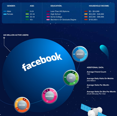
This is what part of the original looks like:
Many decorative details which make it difficult to understand the information. There is a lot of “noise” and lost space, but it looks nice and cool!
The social media networks are depicted as planets – with different sizes, although the planets’ areas really doesn’t represent the amount of users – and the demographic facts are shown as donut satellites. More planets, rockets, satellites and comets complete the picture. The whole infographic is low-keyed and shows additional information in texts for each network. A typical infographic …
There is only one problem: It is nearly impossible to read and understand the information shown.
Besides the fact that one should prefer bar charts to pie or donut charts. Old hat, let’s forget about this ….
The comprehension of the infographic is getting really complicated because the legend to the different demographic factors is only shown once, at the top of the graphic. It is very difficult to remember the colour scale when you scroll down to the different networks. Another problem is that the colour theme of the legends does not only wander from dark to bright colours but these colours are chosen randomly.
Since the arrangement of the coloured elements in the donut chart are not always the same, my eye-brain system is completely overwhelmed.
The infographic looks nice and cool, but its user value is naught.
But the icing on the cake is the graphic at the bottom: again rockets, satellite antennas and planets. Shall the area or the height mirror the values? Or both? Fine, that there is an additional value axis 😉
As I wanted to rebuild the infographic I had to copy the values from the diagrams. Even with a copy of the legend in another open browser tab it was hard work – and it is not the fault of the second glass of wine.
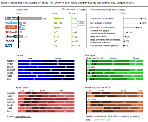
Here is my alternative draft as a picture:

The original has some interactivity, too: if you click on a social network in the first graphic, additional text information to this network is shown and the grey bar in the stacked chart is moving.
My aim was to enable comparison. Only with the comparison of the different networks it is possible to gain in sight. But for this goal we need the information at a glance – and graphically edited.
My design might not be as fancy as the original but I think it is much easier to read.
Graphics, charts, and maps aren’t just tools to be seen, but to be read and scrutinized.
Alberto Cairo, in: “the functional art – an introduction to information graphics and visualization”, S. XX.
One last point: On reading the graphic more closely it is obvious that there is a differentiation within the networks between “active users”, “unique visitors” and “registered users”.
I can’t escape the feeling that here apples and oranges are compared.
the best,
![]()
_
![]()
This file is licenced under the Creative Commons-Licence.

