The graphomate matrix is our powerful table

The graphomate matrix is our powerful table visual for Microsoft Power BI, Excel and PowerPoint as well as for Tableau and SAP Analytics Cloud (SAC).
It combines clean data matrix visualization with expandable hierarchies or a crosstab view, and flexible In-Cell data visualizations.
Trends can be visualized per row via the sparklines or sparkbars feature, complete with detailed value information on hover.
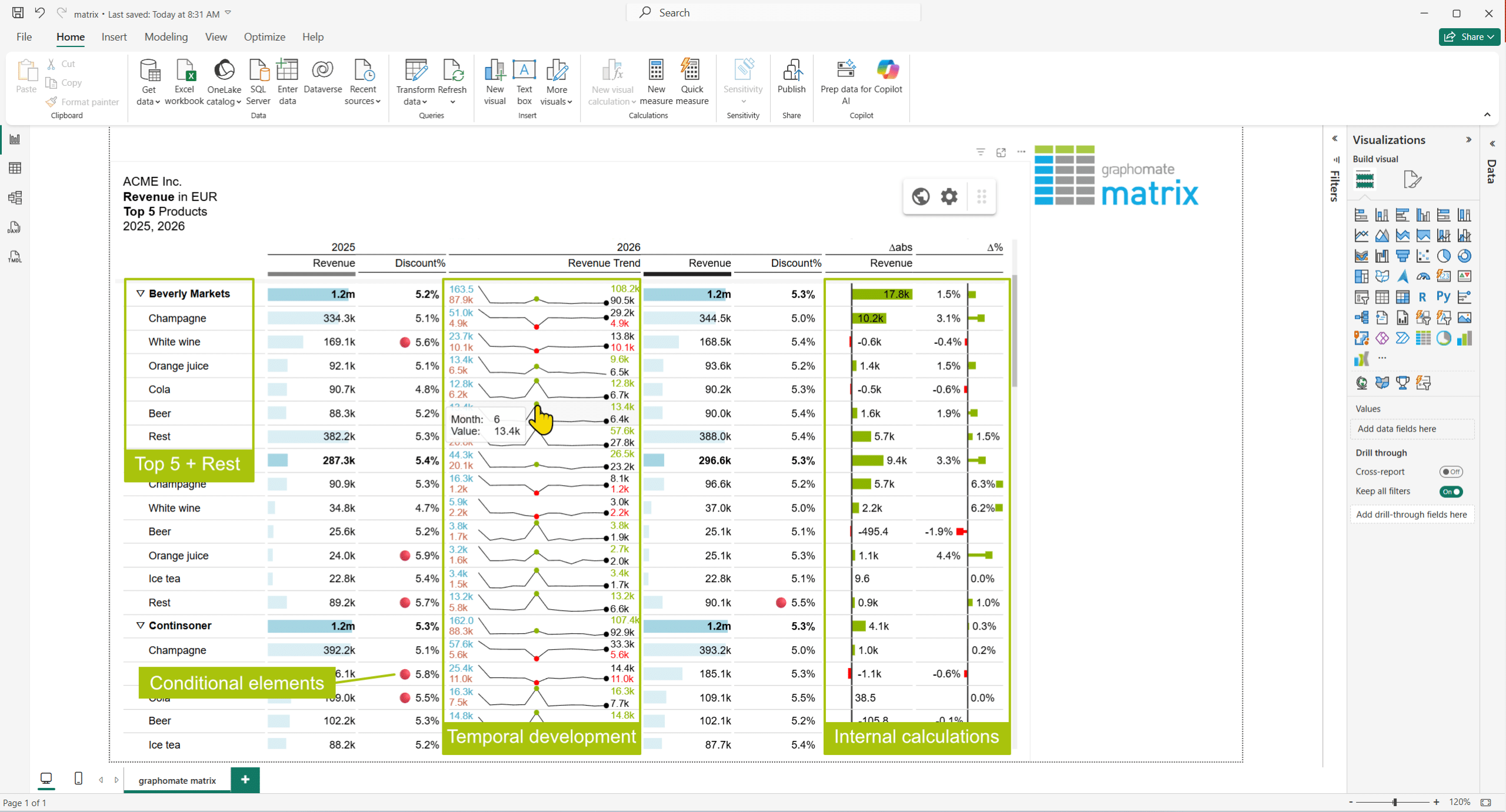
On top of that, our matrix can internally calculate deviations and custom members, condense your data with the N+Rest option, and fully customize the sorting of your dimension members in rows or columns.
Columns which are only necessary for internal calculations can be hidden. Column width can be defined precisely or automatically using the available space.
It provides the ability to format your matrix according to IBCS®– or now ISO – standards with predefined scenarios for the various datatypes. These scenarios are reflected not only in column headers but also in the In-Cell visualizations, like background bars and deviation charts. You can also define your own scenarios.
Complex data driven formatting can be achieved with our implemented script language, which is based on Java Script and can be written with the help of our custom web editor and our available AI Skills.
Watch our video to learn more about our graphomate chartrix for Power BI:
Have a nice day,
Alex

This file is licenced under the Creative Com