Visualization: A chart that fumbles with numbers – nothing more
Last week, I stumbled upon this chart. I went ballistic, because the “game plan” is a fumble. Let me try to tackle the problems:
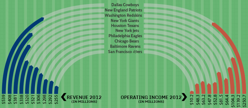
- First of all, the vertical lines in the background make no sense – maybe they shall represent the yard lines on a playing field, but then there are too many lines.
- Second, the goal of this chart seems to be a comparison between the revenue and the operating income in 2012 of ten American football teams. The chart maker definitely dropped the ball here: How do you compare the figures when the scaling is completely wrong?
- For example, look at the revenue of the Dallas Cowboys: 539 Million Dollars. And now compare it with the operation income representation: Without the numbers beneath the lines I would deduce that the operating income is nearly as huge as the revenue. Wrong – according to the number below, the operating income is only 46% of the revenue: the vizualization does not help me to see the difference.
- But that is not the only fault: Try to compare the figures within the revenue part of this chart: The revenue for the San Francisco 49er’s is $255 Mio. So the line representing the revenue for them should have around 50% of the length for the Dallas Cowboys. As you can see, it is a lot shorter.
So, what is the use of this chart? Right now – there is none.
graphomate has a different approach to visualizing data – our goal is to inform, not to decorate so we reduce our charts to the essentials without using “noise”. Our approach is based on the renowned SUCCESS– concept by Prof. Rolf Hichert. This chart breaks three of the HICHERT®SUCCESS rules:
- SAY: what is the message? Right now there is none – one only compares two sets of figures, without giving a clear message: it would be interesting to know where all the money has gone – marketing, players, franchising and whether the amount spent says something about the sporting success (Btw: the Baltimore Ravens won the Super Bowl in 2012)
- CHECK: Unify the representation of data. Comparisons can only be made if the data basis is shown in a comparable way – this means, above all, using identical scaling for the figures. In addition, the chart lacks an appropriate way of showing the data: bent lines with a different radius do not allow comparison.
- SIMPLIFY: The use of “noise” , any form of design which does not contribute to the meaning , in this case the bent lines, gaudy colours and details like the redundant vertical lines distract from the information in the chart as such.
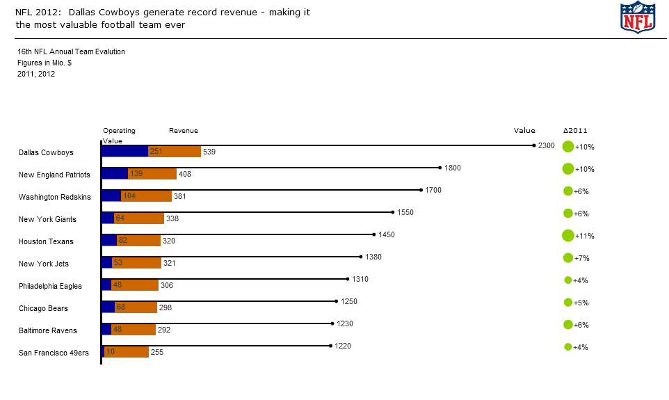
It could easily have been changed into a more informative chart – I made the following chart with our graphomate charts addon for SAP BusinessObjects Dashboards (Xcelsius) :
![]()
The representation of the figures in a bar chart lets you the see difference between revenue and operating income at a glance – and for those who want to know the exact percentage: the needle chart shows the figures. But although it is easy to convert a ballistic chart which contains litte informational value into a meaningful chart with our graphomate addon – the original visualization is still good for optimization.
- Right now, the chart only states the huge discrepancy between revenue and operating income. But we do not see the important things: According to an article in the Forbes magazine, the $539 million revenue of the Dallas Cowboys marks a record – never before has a NFL football team reached such a huge amount in revenue.
- It also means that the Dallas Cowboys is the one of most valuable sports team in the world – with Real Madrid leading the list with a value of $3.3 billion. Each team’s value has risen since 2011 due to new contracts, namely CBA (collective bargaining agreement) which states that the team owners only have to pay 47 – 48% to their players instead of 51%.
All the figures and data can be found on a Forbes Website, which also provides a lot of background data. Maybe next time, the original “designer” should a look at this website – perhaps his chart would not have been so cagey.
The best,
Manu
_
![]()
This file is licenced under the Creative Commons-Licence.