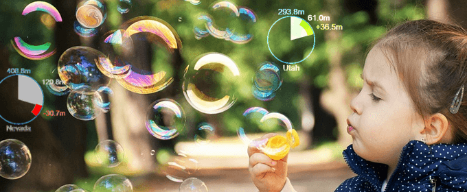
More than just shimmering bubbles

Once again, we sat down at the workbench to craft a new component. The result are the graphomate bubbles – a visualization component für SAP Design Studio, which can display either a scatter plot or a bubble chart with up to five data dimensions.


Highlights:
Bubble-Chart and Scatterplot
The graphomate bubbles can be used as a bubble chart to display up to five highly aggregated data dimensions in a portfolio. Using two dimensions you can create a scatterplot to spot correlations and to identify outliers.
Customization
The layout as well as the appearance and behavior of the graphomate bubbles can be configured widely including the elements’ padding, dimensions and colors as well as the components’ scaling and number formatting. Furthermore, it features scripting methods to change properties or to realize click events.
Labels
Meaningful labels are essential for perceiving the displayed information quickly, but they can confuse the user by colliding with each other or by being too long. That’s why we implemented a complex collision detection that hides colliding labels and makes sure that the visualization looks clean and comprehensive. Moreover, the category labels are generated from the data sources’ dimension members taking into account that only the names of distinct ones are included. So the category labels of ten bubbles representing the same country but different cities will only include the cities names, while the country name gets outsourced to the axis label. Of course this automatism is configurable and deactivatable as well.
Runtime Interactivity
At runtime you can hover over a bubble with the cursor to set its temporary focus and see detailed information on the used data series and values.

The scatterplot displays two data dimensions on its axes for quickly spotting correlations between them and for identifying outliers. In a bubble chart the graphomate bubbles can display up to 5 data series. Therefor it uses the Pie Module, already known from the graphomate tiles. It replaces the dots of the scatterplot and adds the following data dimensions:

Next to the two diagram axes the area of a bubble is data driven. In addition, a fourth dimension represents a share of the bubbles’ area by displaying a grey arc. The fifth dimension contains a base value used for calculating a deviation to the grey arcs’ value. As an example the area could represent the gross, while the arc displays the budget plus a deviation from the previous years’ budget.
Now, that you know about the features and appearance of our new component you can try it out yourself. Just ask for a free trial version via email: info@graphomate.com or just use the appropriate form.
Happy bubbling,
Tim & Daniel
_
![]()
This file is licenced under the Creative Commons-Licence.
