Some news on our graphomate bullet graphs

Some time ago, we presented the graphomate bullet graphs extension for SAP Design Studio. Bullet graphs – originally designed by Stephen Few – are a more comprehensive alternative to gauges when it comes to visualizing data. In early March this year, Rolf Hichert and Jürgen Faisst suggested a few improvements, of which we naturally took the opportunity to incorporate into our extension…
Rolf and Jürgen saw the following possibilities for improvement:
+ Emphasis of deviations of targets from current values
+ Waiving the third Qualitative Range
+ Normalization of target values
Since our bullet graphs already support a corporate-wide notation concept, we’d like to present our implementation of those three suggestions. Of course, these are optional 🙂
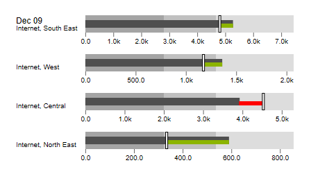
To start with, here are our graphomate bullet graphs with deviation bars and empty markers (notation!) for plan values:
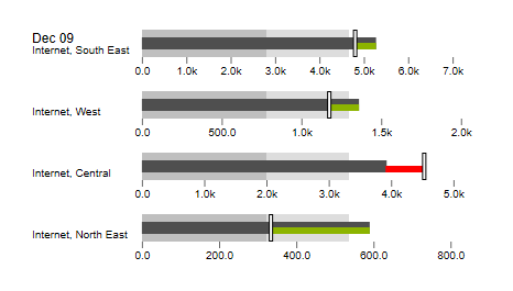
Using our modular kit-approach, waiving the third Qualitative Range is easy. The ranges are data-bound, or can be calculated using percentages of a base value. Thus, the third range can be easily “switched off”.
As basis for the normalization, we used the data series for the Comparative Measure: each value in this data series is regarded as 100% for its bullet graph; all other values are visualized as percentages of the comparative markers. As you can see, we still keep the absolute scaling; percentages are used only under the hood:

It is of course possible to use other data series than just the Comparative Marker as 100% threshold. Already quite close to the suggestions of Rolf and Jürgen, right?
However, Stephen Few made an – in our opinion – rather interesting comment:
“You suggest that the target values should be normalized. What you did, however, is not a normalization of the metrics. Normalization would involve a common scale. Instead, you merely aligned their target positions.”
Since we normalize to a common scale – namely 100% – percentual deviations are visually comparable.
Even so, bullet graphs using this scaling option are not comparable to each other if they display absolute values. It is only possible to compare bullet graphs if we use a percent axis.
To provide further information about the relevancy of a single bullet graph, the absolute values of the Performance Measure can be displayed. However, in our opinion, Micro Pies displayed in front of the bullet graphs are better suited to achieve this – these visualize the proportion of the Performance Measure of the overall maximum, and can easily be activated with a mouse click:

The features described above will of course work with both horizontal and vertical alignment.
The version containing these features will be released at the start of Q3 2016. This will also contain the comparison group for the graphomate bullet graphs, so bullet graphs can use the same scale as other graphomate components.
Hope you like it …
All the best,
![]()
_
![]()
This file is licenced under the Creative Commons-Licence.