Finally: Solid, Outlined, Hatched … the book by Rolf Hichert and Jürgen Faisst

We have waited a long time, but now it’s available in English on demand: the book about visualization of management information by Rolf Hichert. No click instructions for generating a stacked bar chart in Excel, no poster or website with dozens of (SUCCESS) rules, but a 232-page textbook.
First of all: “This book is a good book. The author wrote it himself”. 😊
OK, seriously.
„Solid, Outlined, Hatched“ is very nicely presented: high-quality paper, multicolored printed and even with “book ribbon” … that makes a difference.
The layout is two-column and therefore very reader-friendly and the pages are usually divided horizontally into two parts: diagrams or other report objects at the top and the explanatory text below:
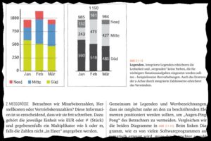
I also like this very much.
A little anecdote: Most of the diagrams and tables in the upper half of the layout are actually drawn by hand [sic]
Regarding the content: The book consists of four chapters with introduction and outlook – and an index.
Chapter 1 deals with the basic topic: How can we assess situations more easily and quickly? Through pattern recognition! The best way to do this is to visualize data. I like the historical outline in this chapter. Maybe because I have dealt with this topic quite intensively myself. In particular with William Playfair, the old rascal and accounting forger …
The following chapters are certainly the two most important: In Chapter 2, a visual language for business communication is first developed and then applied to diagrams and tables in business contexts in Chapter 3. I read these chapters with great enthusiasm, as they are finally a written version of the contents of the IBCS seminars offered. Perfect to look up and deepen!
In an excursus to chapter 2, a proposal is made on how the semantic specifications for measures could be extended. For example, the measure “Revenue” will be described by the symbol “˄” while “Costs” could be described by a “˅”. The authors also develop symbols for other key figures such as assets, liabilities, share capital ….
As much as I can understand the concern to extend the idea of a notation by further elements – and I expressly support this – it becomes clear to me how difficult this will possibly become. The complexity is simply very high. The symbols are not self-explanatory and have to be learned – just like musical notes or the elements of a circuit schematic. The authors also note that “Due to the diversity and company-specific individuality of structural dimensions … comprehensive standardization is a challenge”.
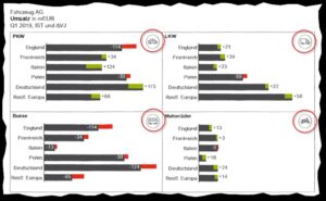
In my opinion, a first and perhaps simpler step in the right direction would be the use of icons – which the authors also suggest. Here is an example of a book from the automotive industry:
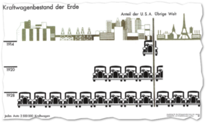
I am very enthusiastic about icons, but I can spin their use even further and think in the direction of Otto Neurath’s ISOTYPE concept:
We are currently developing a new component that allows the use of icons as so-called pictographs – bars of icons. Scientific studies prove „that pictographs embedded as part of data mapping are beneficial … and entice people to inspect a visualization more closely“.[1]
Chapter 4 outlines the structure and contents of a notation manual and shows templates for and examples from practice. It is impressive to see the quality with which some companies have structured their reporting according to IBCS. Also a customer example of graphomate is included: an interactive dashboard of the Swiss retailer Migrolino.
At some points the authors’ suggestions deviate from or go beyond the International Business Communication Standards (IBCS). It is therefore not a „pure“ IBCS application book, as it is enriched with the authors’ own ideas. It is very important for me to mention this, because as an IBCS-certified software provider we (must) orient ourselves to the IBCS.
What I would have liked to see is a chapter on the scientific foundation of the authors’ visual suggestions. Unfortunately, this is only touched on very briefly and Edward Tufte is often quoted.
In summary, I can clearly say that the book by Rolf Hichert and Jürgen Faisst is a well-structured and easy-to-read introduction for anyone who wants to deal with the standardization of reporting or the creation of a notation manual.
Therefore: Definitively recommendable!
I wish a beautiful autumn
Lars
[1] https://visxvision.files.wordpress.com/2017/08/p1191-haroz.pdf, S. 1199
![]()
This file is licenced under the Creative Commons-Licence.