
graphomate
tiles
Modular KPI Dashboard
graphomate tiles are our latest development, which we will release in summer 2022. We already offer a similar solution for SAP Lumira Designer, but now we have completely redeveloped graphomate tiles.
With our new graphomate tiles you can still choose from a pool of different modules, but you are no longer limited to a predefined layout. With just a few clicks on the tile itself you are now able to define the layout. Of course, the popular flip effect – the ability to use the front and back of the tile – is still possible.
The advantages of graphomate tiles at a glance
- Layout definition directly on the tile
- Easy use of predefined modules for visualization of KPIs
- Flip effect for presenting information on the front and back of a tile
- templates available using the graphomate server
- graphomate tiles are fully scriptable
graphomate tiles are available for:


tiles and dashboards
Tiles are used for the aggregated presentation of key figures or key performance indicators (KPIs) in dashboards. True to Ben Shneidermann’s mantra “Overview first, zoom and filter, details-on-demand”, graphomate tiles are ideal for getting started with an application or dashboard. Users get a quick overview of all relevant KPIs and can navigate to further details as needed. But also in operative systems the tile idea finds more and more followers. Certainly also promoted by SAP Fiori.
However, a new technological foundation was necessary to make graphomate tiles generally ready to run in all of the BI tools we support, SAC, Power BI and Tableau.
First we start with SAP Analytics Cloud (SAC) – next to the existing solution for SAP Lumira Designer.

One tile – many options
The modular concept of graphomate tiles makes every wish come true. Configure your own layout and tiles for your dashboard with just a few clicks. You can currently use the following modules:
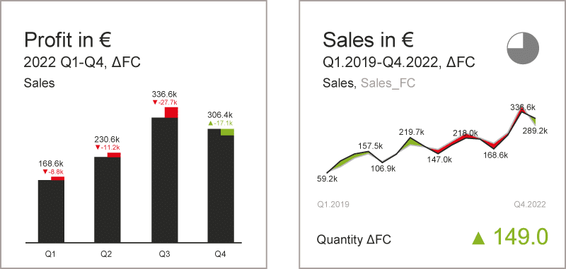
Line Chart
You want to see at a glance whether threshold values are exceeded or not? Simply use the line chart module of graphomate tiles. If the ratio exceeds a given value, the area above or below the line turns into defined colors – e.g. red/green.

KPI
The key performance indicators of every company show the actual situation clearly and concisely. Deviations from a reference value can be easily visualized by using colors and symbols.

Title
For easy and quick orientation on the tiles, it is important to specify the context. For this please use the title module.

Text
In addition to the title module, this module allows you to include short text passages.

Icon
We all remember images better. With the icon module you can use this advantage and include any icon you want in your tile.
column chart
Of course, the classic column chart also belongs in the graphomate tiles. Visualize measures over time with a simple column chart.

bar chart
If you want to visualize comparisons between regions or product groups, for example, we recommend horizontal bars.


