graphomate charts: an overview – the magic is in the details (1/2)
After I had published a first video before Christmas, now it is time for some detail information about our graphomate charts addon for SAP BusinessObjects Design Studio.
It’s incredible: two months without a post in this blog. Why? – Because in the past two months we were overwhelmed with inquiries and orders for our graphomate charts. This is great, but that’s why I neglected other things such as writing blog posts and rework the website.
Now we have already released our first support package and I would like to take this opportunity to explain in two articles the visual possibilities of graphomate charts in more details.
The concept behind graphomate charts are the SUCCESS Rules of Rolf Hichert that are now internationalized under the label “International Business Communication Standards” (IBCS).
With graphomate charts we implemented HICHERT®IBCS as an easy to use application that is fully integrated with SAP BusinessObjects. Currently you can use graphomate charts in SAP BusinessObjects Design Studio and Dashboards (Xcelsius). Furthermore the rules of Information Design by Edward Tufte and Stephen Few can be easily illustrated with graphomate charts.
If you want to test our addon, you can get a demo version of graphomate charts for Design Studio 1.2 now! Just send us your contact information to sales@graphomate.com.
The graphomate charts offer a whole set of new chart types that can be fully adapted and formatted to the visual requirements of your reporting. We differenciate the following chart types that can be also used in a small format as so-called micro charts or sparklines:

We recommend these chart types to visualize trends over time. Comparisions of structure or ranking can be compared more effectively by using charts with vertically oriented category axis:

You can use all chart types horizontally or vertically aligned and use up to 10 data series. The data series will be arranged one after the other and one above the other respectively in the stack chart. In order to make the visualization comparable, it is possible to use the same scaling of the charts with an identical value axis.
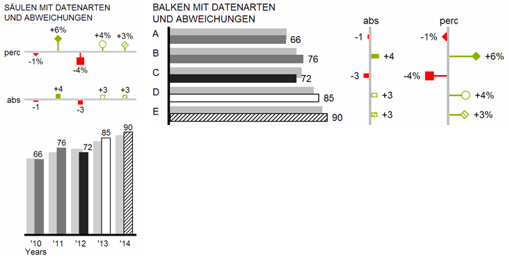
graphomate charts allow you with simple clicking to build two or more deviation axes above all types of charts in order to show the percentage or absolute deviations between two data series. Of course, you can also set names for this deviation series and show them in the chart.

In addition, you can format each element of a chart independently. This takes place via so-called data types. Using data types you can create an individual visual language for your corporate communication. Data types are defined in the data types editor and then the created shortcuts are assigned to the corresponding elements of a data series on the data tab. Color, fill, form and width of the chart elements can be defined by data types.
At the end, once again a video that shows how easy it is to use graphomate charts in Design Studio:
According to the license model of SAP for Design Studio and Dashboards our customers that buy a designer license become entitled to use graphomate charts in SAP BusinessObjects Design Studio as well as Dashboards (Xcelsius).
You will learn more details about graphomate charts in my next post in which I will show other features such as the waterfall charts.
As Theodor Fontane said: “The magic is always in the details.” J
The best,
![]()
_
![]()
This file is licenced under the Creative Commons-Licence.