From gauges to bullet graphs

Speedometer or gauges are still often used in dashboards to display Key Performance Indicators (KPI). But gauges use lots of space and are not very informative. The graphomate bullet graphs therefore offer an alternative for SAP Business Objects Design Studio.
Especially in management reporting gauges seem to be the only option. Here are a few examples from well-known BI vendors:

Except for tableau probably any BI software has to have gauges. SAP BusinessObjects Dashbaords (Xcelsius) even offers eight (!) different gauges layouts.
I do not know why CxOs love the gauges, but at this strategic level they are not useful in my opinion: a thin density of information and decorative elements do not contribute to a better understanding of the information.
And I’m probably not the only one: “I hate the gauge. It is a stupid waste of space.” Design Studio still do not offer gauges as a standard component, but the demand is there.
In the middle of the last decade Stephen Few already developed the bullet graph as a substitute for speedos and gauges in dashboards.
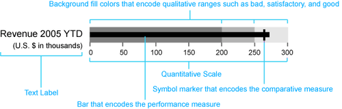
A bullet graph is a variation of a bar chart. The bullet graph shows a so-called Performance Measure (eg, the accumulated current revenue) as a bar and compares it with other indicators – the so called Comparative Measures (budget or forecast values) which are shown as symbol markers. The Measures are shown in the context of three Qualitative Ranges, that are displayed in varying intensities of a single hue in the background of the bullet graph. This qualitative scale visualizes the target achievement: bad, satisfactory and good. A scale of values and category labels complete the appearance of the bullet graph.
So far so good! But what about negative values? What if I want to compare the sales revenue of different distribution channels? What about indentical scaling then? And where do the data for the ranges come from?
To answer these questions easily we developed a component for Design Studio, that visualizes a bullet graph based on a data source within a few clicks:
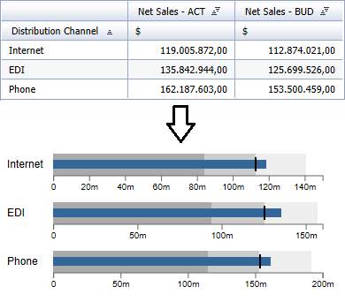
In the example I selected two columns of a “flat” data source for the Performance Measure “Net Sales – ACT” (blue bar) and the Comparative Measure “Net Sales – BUD” (vertical marker). According to the number of dimension members – here distribution channels – multiple bullet graphs are drawn. As the data source does not provide values for the Qualitative Ranges, our add-on calculated these based on the Comparative Measure by percentage decreases/increases.
This short one-minute video shows the development process of this bullet graphs:
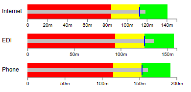
Of course, it is possible to use a second Performance and Comparative Measure. You can change the colors and sizes of all elements according to the needs:
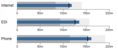
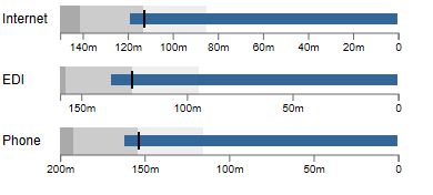
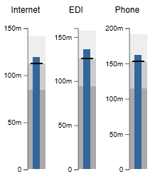
But is the visual impression correct? Is the revenue of the distribution channel “Internet” as high as the one of “Phone”? No, because the three distribution channels are not scaled identically. But that can be easily caught up with the parameter “use identical scale”.
To show bad rated measures both the scale and the orientation of the ranges can be reversed via mouse click – very useful for cost items:
And finally, you can also align the graphomate bullet graphs vertically:
We offer the graphomate bullet graphs for a one-time, company-wide license fee of 6,000 € plus yearly support.
Please contact us: sales@graphomate.com.
That’s it …
![]()
_
![]()
This file is licenced under the Creative Commons-Licence.