A Good Overview Creates Added Value.
Basic idea of visualization
Why do we visualize data and present it graphically? Or, quoting Monty Python with a wink: “What are the figures, what the facts?” In all seriousness: Why do design guidelines and standards help interpret these diagrams? Essentially it is always about an improved decision support!
We are convinced that data visualizations are important for a successful decision making process. Meaningful diagrams and tables help in both ad hoc analysis (exploration) and regular reporting (explanation).
Create real added value with graphomate extensions
graphomate extensions for Power BI, Tableau and SAP Analytics are our visualization extensions. They follow the rules of good information design to create meaningful visualizations. The basic rule is: “Information instead of decoration!”.
With our components, you can depict a uniform visual language across all tools – thus creating added value for your reporting system.

Visualization helps with decisions
The communication of business data is still very table-oriented. Tables may depict data precisely, but do we see the story behind the lines and columns of numbers? Can we easily decipher patterns, trends or outliers? Not really…
Here exactly lies the strength of charts: visualizations enable decision makers to quickly assess the current situation.
Frequently though, this understanding is hampered by so-called “noise” (3D effects, too many colors etc.).
graphomate extensions offer simple and clear visualizations based on rules for good information design: no effects, no 3D, no unnecessary colors and a consistent standardization of visualizations.

Consistent Visual Language
Composers have been using a uniform visual language to capture tunes for generations. With the help of this notation, musicians – no matter which language they speak – are able to play a song together. A similar situation with schematic diagrams whose standardized elements can be read by engineers.
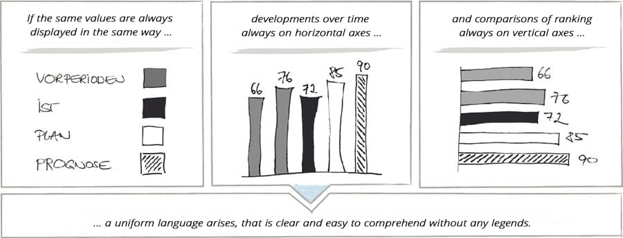
The International Business Communications Standards (IBCS) aim to establish this approach for business reporting as well. Their principle: If the same content is always displayed in the same way, reports can be grasped quicker and comprehended better.
A simple rule is to always depict previous year figures in light gray and actual values in black. Budget values are depicted in white with outlines and forecasts are made distinctive with a hatched background.
Implementation of IBCS with graphomate extensions
graphomate extensions offer these and even more possibilities to create your own visual language – your own company notation.
However, IBCS contain further guidelines for meaningful reports and presentations beyond this aspect of notation. These visual rules of IBCS are also implemented with our graphomate extensions.
graphomate extensions offer you
- ongoing standardization for uniform visual language,
- reduction to the essentials and
- consistent structures and clear messages in business reporting
in order to implement a “true and fair view” in business communication simply and quickly.
IBCS-compliant charts and tables can easily be created by Dragging and Dropping them into Power BI, Tableau and SAP Analytics. It is even possible to export and import templates of graphomate extensions between these front end tools.
Conclusion: Good data visualization makes it easier to understand the report, try it out!


